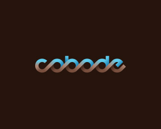
Description:
For an architect that designs modern co-living houses.
As seen on:
BEHANCE
Status:
Nothing set
Viewed:
13268
Share:

Lets Discuss
loooooove this. not sold on the colours but love the mark itself. fav'd
Reply%5E what he said different colors! -o-
Replythanks matt %26 lattrasis. totally agree - i think i'll work on some colours tonight. in the mean time i've lost the ghastly green.
ReplyReally like this, neat execution. I look forward to seeing the new colour.
ReplyUpdate is great change. I like that the lower colour is analogous with the BG and the top is a bright, colourful contrast. Keep playing but I like this idea
Replyflow is really nice, colours not so much, with a little work this could be really special
Replythanks for the positive comments %26 feedback richard, matt %26 s7even. i've decided to explore the brown and blue a little further in this version
Replyreally liking the colour of the lower brown now. The blue isn't really my taste but I can't say it's wrong, as it definitely has contrast, and I don't know the market.
Replythanks again for your feedback matt. the client is really happy with the blue but wants to see a green variation. he's happy with the browns.
ReplyNice, that's good to hear!
Reply%5E what everybody said :)
Replyupdated colour scheme
ReplyVery like this, especially colors :)
ReplyGreat stuff!
Replythanks matto! great to hear someone liked the colours.**thanks also art machine
ReplyWow, the colors in this version are killer. I like this one.
Reply%5Eyes, very much agree. It's tough to pull off such a strong gradient of contrasting colors, but this works well.
Replythanks heaps guys. This one took a back step to the one that was gallerized, but i'm a big fan of this combo also.
Replynice work here, but wasn't this already in the gallery?
ReplySeems not... or I guess it was reworked. However, it is totally worth the gallery.
ReplyNice – with those colours I get a feeling of eco cool in summer and warm %26 cosy in winter
Replyg r e a t
Replysuperb!
ReplyNice logo.. Selfmade font or?
ReplyLovely. The colors cause me to see sea waves and sand.
Replygreat type!
Reply%5E%5E not sold that that's a ripoff.... just a poorly executed logo
Replythis is beautiful**(I thought I had already commented on this?)
Replythank you everyone for the kind words. @ bedemand: yes, self made, you can see the type construction stage on the behance presentation.
ReplyThere was an abc logo in gallery here before this. totally reminded me of it, same repeating letterforms.
Replya bit different but kinda the same. http://logopond.com/gallery/detail/41266
ReplyVery good
ReplyG'day Mike, yeah, abc and hyperborea's 'logohype' logo both use similar technique... both before mine. I think when faced with a word that has a continuation of round letters, connecting them one way or another becomes an option to create a nice flowing logotype. in my case when given the name from the client i immediately put pencil to paper and came up with pretty much exactly what you see here.
Replythanks shakir!
ReplyC o o l
Replyinfinity
ReplyThanks guys! Much appreciated.
ReplyThousands like this I think %3B)*However very well treated. I like the 3D chain-like in it.
ReplyPlease login/signup to make a comment, registration is easy