by TKhoury • Uploaded: Oct. 25 '08 - Gallerized: Oct. '08
Add to Pad (In 173 Pad s )
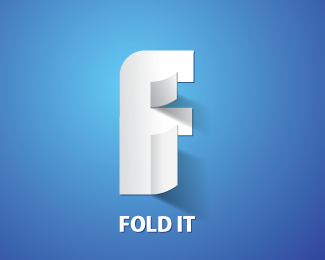
Description: CONCEPT Status: Nothing set Viewed: 62028 Share:
very well executed
thank you janzabransky
thanks Tonfue
omg this is so cool! how did you do the effect where it lifts up? just shading?
Very cool. Also good opportunity for just the counter of the P to fold up. Either way...nice.
Would be even cooler if you change the name to %22folded page%22 that way the hidden %22f%22 followed by the %22P%22 would make more sense...**:0)
oo yes i like it.**clever mark :)
Wowwie! excellent concept.
thank you muscle for the comments i will try it.
Clever concept and very well executed. Nice work, bud.
I would choose the other one (fold it) but this one is great too
Only if the name was Fold Page.. Nice work..
%5E TRUE that! I actually think this design is way better that your fold it IMO. I can see this working as a solid B/W also. Just me but I prefer this design.
The shading looks better on this one
i want to see a version without shading :) just two colors
Excellent concept! Very clever and eye catching.
thank you
thank you Houston-we
let me see it in B/W...
Excellent, excellent composition, shading, and strong color usage. Bravo.
amazing.
Very original and excellent like the other. %3D)
Hey man good control of lighting. god job.
not trying to stir any trouble here but just FYI... http://joefino.com/Pages_1/S21.html
This logo is amazing. It isn't just the fold in the 'P', the use of light in the letter and the shadow is just brilliant.
n oh, i just saw the letter 'F' when the 'P' is folded. Double brilliant.
clever. just f* clever. :)*
awwsommmee !!!
very strong mark
datsfine.realy GOOOOOOOOOOOOOOOOOOOOOOOOOOOOOOOD
great!
The 3d effects really stands out on this one, keep 'em coming!
This logo is amazing.
Hey heads up!! Im not sure but it seems that http://www.entheosweb.com/inspiration/logo_design_ideas.asp is stealing your logo design and making it look like they designed it. Along with many others here on Logopond.
Nice!!!
Please login/signup to make a comment, registration is easy
Follow


Lets Discuss
very well executed
Replythank you janzabransky
Replythanks Tonfue
Replyomg this is so cool! how did you do the effect where it lifts up? just shading?
ReplyVery cool. Also good opportunity for just the counter of the P to fold up. Either way...nice.
ReplyWould be even cooler if you change the name to %22folded page%22 that way the hidden %22f%22 followed by the %22P%22 would make more sense...**:0)
Replyoo yes i like it.**clever mark :)
ReplyWowwie! excellent concept.
Replythank you muscle for the comments i will try it.
ReplyClever concept and very well executed. Nice work, bud.
ReplyI would choose the other one (fold it) but this one is great too
ReplyOnly if the name was Fold Page.. Nice work..
Reply%5E TRUE that! I actually think this design is way better that your fold it IMO. I can see this working as a solid B/W also. Just me but I prefer this design.
ReplyThe shading looks better on this one
Replyi want to see a version without shading :) just two colors
ReplyExcellent concept! Very clever and eye catching.
Replythank you
Replythank you Houston-we
Replylet me see it in B/W...
ReplyExcellent, excellent composition, shading, and strong color usage. Bravo.
Replyamazing.
ReplyVery original and excellent like the other. %3D)
ReplyHey man good control of lighting. god job.
Replynot trying to stir any trouble here but just FYI... http://joefino.com/Pages_1/S21.html
ReplyThis logo is amazing. It isn't just the fold in the 'P', the use of light in the letter and the shadow is just brilliant.
Replyn oh, i just saw the letter 'F' when the 'P' is folded. Double brilliant.
Replyclever. just f* clever. :)*
Replyawwsommmee !!!
Replyvery strong mark
Replydatsfine.realy GOOOOOOOOOOOOOOOOOOOOOOOOOOOOOOOD
Replygreat!
ReplyClever concept and very well executed. Nice work, bud.
ReplyThe 3d effects really stands out on this one, keep 'em coming!
ReplyThis logo is amazing.
ReplyVery cool. Also good opportunity for just the counter of the P to fold up. Either way...nice.
ReplyHey heads up!! Im not sure but it seems that http://www.entheosweb.com/inspiration/logo_design_ideas.asp is stealing your logo design and making it look like they designed it. Along with many others here on Logopond.
ReplyNice!!!
ReplyPlease login/signup to make a comment, registration is easy