Description:
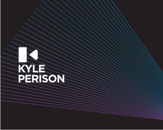
A different approach. Camera from the side plus the camera lens in shape of a diamond (client specializes in wedding photography). Also letter "k" appears in the negative space.
As seen on:
-
Status:
Work in progress
Viewed:
18456
Share:

Lets Discuss
Nice solution Rokac.
Replyyes, very nice%0D*%0D*%0D*
ReplyInteresting solution Mr. Roko . Love it ...
Replyway to go man, great concept.
ReplyWinner.
Replynice work
Replygreat approach on it
Replygreat idea... I love the simplicity but feel the diamond shape is still %22too much%22... I would personally just have a triangle....
ReplyAwesome simplicity
ReplyAgree w/ nido. Also... Gotham... it's a new Copperplate, way too overused now. I would consider some alternatives, e.g. Proxima Nova and similar.
Reply%5ECompletely agree with Tony. Only will %22seem%22 overused to actual designers. 99%25 of the general public has probably never heard of Gotham.
ReplyReally like this btw :)
ReplyWell said Tony.
ReplyIt's cool even without the line-thingys!
Reply@Anthony - Gotham is overused means that it is now a body font for a box of Pampers, your run of the mill Walmart coupon book as well as a Chinese place across the road. So the chances are that it no longer _fits_, because its a commodity font. No one is saying that a geometric font is a bad choice, but there's plenty to choose from aside Gotham.
ReplyBesides this _is_ an identity logo. I'm sure you know how popular Gotham is for this specific application.
ReplyIMO Gotham is not all that unique and different, so I find it acceptable here. BTW Really Clever mark Royak.
ReplyMany thanks to everyone.*@Alen*Haha, svaka cast, da, vuce definitivno malo na %22Vijesti iz kulture%22:)*@Nido*Thanks for your thoughts. I've tried with a triangle but for the whole story/visual system I need that diamond:) By the way I think the diamond is rather subtle, not that much emphasized.*@Epsilon*I hear you and I do agree that %22Gotham%22 is overused but just as Anthony mentioned%3B quote: %22If Gotham fits, it fits, use it.%22 :-) Also this one is WIP so in the end I may end up using a different typeface.*
ReplyI like it, Royak. great solution combo of the camera, diamond and %22K%22.
ReplySo you are basically saying that if the type were Papyrus, it wouldn't make much difference. **Type is quite obviously an important and integral part of the logo. I'm sure you know that better than myself, and so you appear to be arguing just for the sake of arguing.
Replyepsilon, I don't think that's at all what he's saying. This particular font looks like many others ordinary/average. Papyrus on the other hand is definitely recognizable to about anyone including NON designers.
ReplyAnd it would not %22fit%22 here of course.
ReplyEveryone seems to have selected their faction! :/ there are hundreds of logo use similar fonts, should not be used if the logo is no icon...
ReplyI appreciate your thoughts guys!*
ReplyOverused or not, I must say that for me Gotham is almost perfect type, with its uppercase appearance I would rank it even before Helvetica. I love that typeface.*It's a little bit weaker in Low and Tittlecase though...*So the type and the mark here are pretty much my cup of tea Roko. the only thing that bothers me is the background, but thats probably your envision of rays of light breaking through prism of lenses in the late hours after a hard working day...haha
Reply%5EHa, I knew you're gonna love the background, I mean Gotham!:-)*As for the rays of the light, the inspiration came when I saw the LP cover from Pink Floyd (Dark side of the moon) lying in the corner of my room. That plus, as you said, late hours after a hard working day:-)
ReplyNice work Rokac :)
ReplyBright idea!
ReplyVery nice!
ReplyMind blowing my friend. :)
Replynice minimalistic approach, faved %26 floated :)
ReplyJosh, Ferret, Headdow, Thierry, Ali, Alex, thanks a lot you guys!
ReplyI saw a rewind symbol, making me think of video or audio, not so much photo. Great mark either way!
ReplyRoko the antithesis of Rococo (late Baroque era) very busy. Nice mark.
ReplyLumavin %26 rudy, many thanks.*@Rudy*Nicely said my friend!:-)
ReplySupreme solution Roko.%0D*As for type... I think the most famous logo designers have 8-12 fonts in their bags which they make it work on any design. No matter how old and overly used on every road sign and headline...but Helvetica still does magic for a design solution. Im just adding 2 cents..! :)
Reply%5EThank you Riz.*
ReplyI can see P, camera and K in logomotive :) Very nice!
Reply%5EThanks Action!
ReplyPlease login/signup to make a comment, registration is easy