Teapot
by Rokac • Uploaded: Jan. 26 '10 - Gallerized: Feb. '13

Float
(Floaters:
97 )
Description:
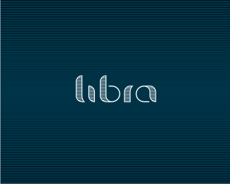
Logo for a young 3d software company. Trying to keep it as simple as it gets.
As seen on:
-
Status:
Client work
Viewed:
28229
Share:


Lets Discuss
That's an elegant little mark you've got there! Love it! :)
ReplyNo kidding. This is great stuff.
ReplyHey, what type/font is that? Very suitable for this design.
Replylovely!
Replycool
ReplyVery sweet.
Replythat is how i like it, clean and simple :)
ReplyThe weight of the mark is perfect for the typography. This is great!
Replygreat simple concept. love the icon and type together.
Replysimply nice, roko!
ReplyMany thanks Michael,Anthony,JF,Niall,Atrem,Sean,Jan,Todd,Thierry,Mike,Bronte and Andrei my buddy:) I really love you gals and guys:)*@JF*Font is NeoTech*http://new.myfonts.com/fonts/agfa/neo-tech/neo-tech/*
ReplyI really, really, really like how you've used this font. Very nice. This is an outstanding logo -- everything is quite lovely. And thanks for the heads up on NeoTech.%0D*
ReplyThanks a bunch JF. Just heard from the client and he's very happy with this one:)
ReplyExcellent!! I am happy this one will be put to good use -- the client is a very smart client.
ReplyThank you JF and Anthony. Yep, definitely one of the best clients I have worked with:)*Cheers guys!
ReplyDefinitely great execution. Though I am having trouble seeing a teapot.
ReplyThanks Julian. Yep, it's a bit hard to see it, but it's there:)*Cheers buddy!
ReplyFYI, client approved this one. Soon it will go live:)*Thanks again for your comments and floats. Love you all:)
Replycongrats Roko, fantastic logo!
ReplyThanks Niall! I really appreciate it!
ReplyRock from Roko %3B). Good work budd!
ReplyCheers Riz:)
Replysimple, clean, beutifull :)
ReplyVERY VERY nice.
Replythis is great, the colors especially
ReplyDeividas, Pierro, Patricia, much appreciated.*Client loves it too:)
ReplyGuess there is no way of simplifying this anymore %3B) Looking good!
Reply@marvin*Hmmm, I'll see what I can do:-)*Thanks buddy!
ReplyLove this a lot!
ReplyDavishama, thanks:)
ReplyRokac, very nice logo design. We are a marketing consulting firm looking for a new logo and would love to talk. thx - strawberry jam marketing
ReplyStrawberryjam, you can contact me at:*info@rokac.com*
Replythe mark and type work together so seamlessly! great work!
Replyagree with all, clear solution
Replyvery good style!
Replyrepetitive , feels like have seen the logo smewhere.
Reply^you've probably seen it in scorpy's portfolio.
Reply@Dan, Rait, Belc, thanks guys!
Please login/signup to make a comment, registration is easy