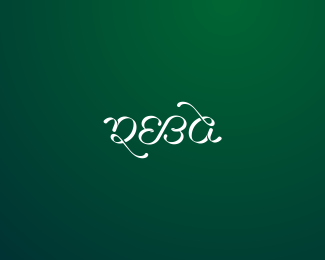
DionyShop
by Rokac • Uploaded: Nov. 28 '09 - Gallerized: Nov. '09

Float
(Floaters:
65 )
Description:
Expensive wine shop.
As seen on:
-
Status:
Unused proposal
Viewed:
15752
Share:


Lets Discuss
Looks really great.
ReplyNice mate.
ReplyThank you Joe and Roy. I really appreciate it guys:)
ReplySays 'expensive' to me! Looks great.
ReplyThanks Gafyn!
ReplyNice one, Rocky! :)
ReplyThank you Alen. It means a lot coming from you:)
ReplyVery elegant. You just keep getting better and better.
Reply%5EAnd now I'm blushing:) Thank you Kevin for your kind words.
Replyvery simple and it gives me the right feeling!
ReplyThanks Andrei:)
Replylooks classy. Did u customize/tweak the %22D%22?
ReplyThanks logotistical. Yep, %22D%22 is customized.*
ReplyI like the D and the dot i , looks really classy
ReplySWeet...or dry, this is good!
ReplyFantastic text treatment. Loverly!
ReplyThank you Cerise, Fabian and Layne:) Much appreicated.
ReplyDig it, CHEERS!
ReplyThank you Rudy:)
ReplyGood stuff.
ReplyThanks mabu. *Also thank you David for the gallery spot:)
ReplyClassy
Reply%5EThanks mate:)
ReplyLove the feel of the %22drop.%22 As in good to the last drop, like this logo!
ReplyThank you mochaleet:)
Replyred or white, i love it!
ReplyHaha, same here. Love them all:)*Thanks mate.
ReplyThanks Derek.
ReplyVery elegant! Great flow, well done! :)
ReplyThanks Michael. I see your working via Rijeka:)*Stop by for a drink or two mate:)
ReplyMissed this one. Awesome integration of the D and I. Kudos.
ReplyThanks Matt!
ReplyYou've got a really nice gallery
ReplyThanks for the kind words Danny!
ReplyBrilliant work!
Reply%5EThanks!
Replynice feel, like the simplicity
ReplyThanks again Florin.
Replylooks realy great:)
Reply%5ETanks Deividas:)
ReplyGreat another one!
ReplyPlease login/signup to make a comment, registration is easy