Description:
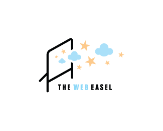
WIP for a web coding company. Words from the brief : creativity, ideas and dreams. Client also requested a tripod easel. This is the general direction so I'd like feedback on how to improve the concept. Thanks!
Status:
Unused proposal
Viewed:
6647
Share:



Lets Discuss
Well...all the tripod easels I've worked on (doing artwork, not photography) have a %22triangular%22 surface that the canvas lays against, so I'd expect to see a vertical line coming above the top of the 'canvas-like' shape, signifying that piece of wood that's there for balance.
ReplyThat's a very good point. Thanks, JF. I'll see about adding that part of the easel in.
ReplyI think these graphics work well because of current reference to %22cloud%22 for web.
ReplyThanks Glen. That's very interesting. I'm going to upload an update soon. I've added the surface to the easel and think it reads clearer now. Cheers, guys!
ReplyFor kicks:**http://en.wikipedia.org/wiki/Cloud_computing
ReplyI am not very sure about the colors, aren't they too light? Otherwise it will be a nice mark i guess.
ReplyThanks guys. Tass, the colors are a bit too light. Client decided on another direction though. I'll post it up once complete. Thanks again!
Reply%5E yep...i don't even recall seeing this :)
ReplyThanks fellas. %3D%5ED
ReplyThat's pretty awesome, Kev.
ReplyI really like this one! more so I like how it can really be dynamic by adding different graphics! Awesome work!
ReplyPlease login/signup to make a comment, registration is easy