Description:
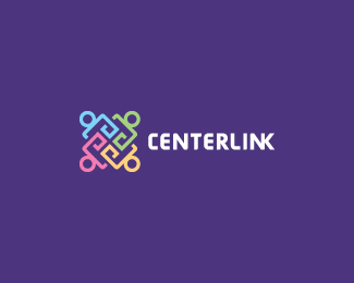
People/Figures linking together.
As seen on:
Ocularink.com
Status:
Client work
Viewed:
12634
Share:



Lets Discuss
Hi Oc'. Nice layout and coulour scheme. Icon looks good to me, clever and well executed. About font, not sure it is a good choice (too bold, this Neo looks a little bit creepy at this size... Damn antialiasing...). I would have considered a more neutral font like Akzidenz Grotesk, Futura, Avenir, Helvetica or even Apex. Also, not quite sure about the final %22NK%22 ligature... Anyway, that's only my humble opinion and your work looks good as usual.
ReplyI personally felt the customized neo looked good, but not so sure about your background color %3B) - excellent intricacy tho
ReplyBeautiful DocOc.
Replynice Doc.
ReplyKevin the Nailman! You nailed it again my friend!
ReplyGreat stuff, and Im diggin the NK %3B)
Replyas always great work Kevin
ReplyThanks for all the support guys. I appreciate all the constructive feedback. The type is custom and I feel it has a nice balance with the mark. Regarding the N/K ligature in LINK, I felt it gave the type treatment more depth. It also made sense to me to have some of the letters %22linked%22 together.
ReplyVery nice...
ReplyThanks cerise.
ReplyVery cool mark.
ReplyThanks Glen!
Replysimple and strong! great work!!!
ReplyPlease login/signup to make a comment, registration is easy