NyxTek
by Mikeymike • Uploaded: Dec. 11 '12 - Gallerized: Dec. '12

Float
(Floaters:
56 )
Description:
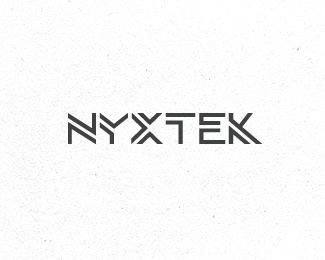
Developed this logo for a company that develops Web sites, Web applications, eBusiness and Customized Software Applications. They are located in South Africa.
They are currently working on the web site so I hope to show that soon.
Thanks.
Status:
Client work
Viewed:
14039
Tags:
cutting edge
•
techy
•
type logo
•
graphic
Share:
Lets Discuss
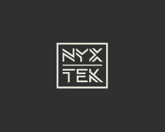
Curious, do you feel the stacked version works?
ReplyI almost like it better.
I like both but wonder if stacked whether people will read as two seperate words Nyx Tek, rather than Nyxtek. Maybe that\'s not crucial, but just a thought. Aesthetically speaking I would choose the stacked/boxed version.
ReplyThanks for the feed back, Jacob.
ReplyIt\'s pronounced (nix)tek some there is a natural break in how you pronounce it.
So I don\'t think it really matters, but they needed a version for the icon in more of the square form, so I felt that this works nicely. Glad you agree.
I feel its a nice secondary version. The type is all custom so I thinks it holds together well in both versions and shouldn\'t be confusing as two separate companies.
Thanks for the critique.
Like you say, nice to have both options and stacked version is good for icons/app/favicons etc. Really like the techy looking type.
ReplyI think I like the stacked version best Mikey!
Replyagree, Big Mike.
ReplyI do think they work well as a whole also, within the brand as they move along.
nice job, mikey.
Replywow ...great type work !
ReplyI like the unstacked version better, but not by much.
ReplyColin, Lefty, Bernd and Brammoolenaar thanks so much for the comments.
ReplyReally means alot. I\'ve been having some tough luck getting some of the concepts through the client process of late, so I was happy to see this one going all the way.
I am happy with it and they are also. so that\'s nice.
And thanks so much for the gallery spot. (to whom it may concern) Always feels good to get something into that spot.
THX all.
nice unique mark.
ReplyThat\'s some cool type work! Actually, I\'ve been real impressed by all your recent logo work Mikey. Good stuff.
ReplydesignerDan, thanks bud.
ReplyDan, a big thanks out to you also, sir. Nice comment, and I appreciate it, very much. cheers.
Animal
Replysolid stuff, the enclosed stacked version is pure gold
ReplySweet type Mikey. The stacked one for me too.
ReplyNitish, :) thanks, bud. nice to hear.
ReplyFlorin, agree on the stacked as I mentioned above. and for some reason I like the horizontal version better on the light background. but I think they all work okay as a whole.
Roy, always a treat to hear from ya. Thanks, man.
No worries Mikey : )
ReplyFantastic Mikey! Lovin it! Both of the versions work, but the horizontal fits the description better. The stacked one plays well as an icon...
ReplyTHX, Roko. :D
ReplyStacked version of course.
ReplyThanks, Jovan!
ReplyPlease login/signup to make a comment, registration is easy