Description:
WIP.
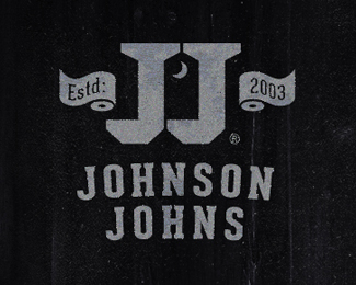
Logo for my friend who just bought a port-a-potty business.
Not kidding.
Status:
Work in progress
Viewed:
4002
Tags:
outhouse
•
toilet paper
•
moon
•
gray
Share:

Lets Discuss
can\'t believe I didn\'t get any crap on this one. :D
ReplyIt would get a few hundred likes on dribbble with that soiled effect ;)
Reply^:)
ReplyBtw missed this one somehow. Great on so many levels...The negative space between the \"J\"s (although isn\'t a heart the usual symbol on the doors:) And I love the fact how it sounds like Johnson & Johnson:)
I give a crap!
happened to me today with my barbiere logo ... lol ... that means the one I did is reeeaally great ... no cuci cuci stuff ...
Replylove all your work !
Roy, yeah I got some interesting feedback on dribbble. :)
ReplyRoko, thanks for giving a crap. And yeah here in most of the US we usually see a crescent moon on the old time outhouse\'s doors. It looks as though they might go with this concept, but they are going with \"Johnson\'s Johns\" still works nicely though I think.
Bernd, Thx, bud always like your comments. cheers.
looks like we have a floater...
Reply^ gross.
Replyoh, real classy, Colin.
ReplyHA!
You know these guys are #1 in the #2 business!
Mikey this is a GREAT business and great logo. I have friends too who own the same business,(smart business). I know it stinks but smells like money to me. I like your outhouse and toilet paper rolls. A bit of history on the name crap and John.
Replyhttp://urbanlegends.about.com/od/factoid1/p/thomas_crapper.htm
Smell of money for sure Big Mike.
Replynice history on the Sir Thomas Crapper also. :D THX.
Yeah my buddy says its a pretty good side business. Hope he does well with it.
Absolutely love this mikey! This is the best port-a-potty logo around. Aside from the clever use of negative space, i like the incorporation of the tp.
ReplyThanks, Dan. Appreciate the comment, bud. The client is thinking about this direction, with some minor changes. Glad you like where its going.
Replycheers.
hey couple more floaters here. (pun intended.) Hee, hee!
ReplyTHX
that\'s very childish of you, mikey.
ReplySorry Colin, :D
ReplyI just read what I wrote and it reads like I\'m begging for floats.
I meant it as a pun cause I received a couple floats, so I thought I could insert a JOKE.
Damn Fridays.
mikey, totally joking too, bud. maybe i need to start inserting emoticons for my sarcasm. remember, i mentioned the \'floating\' a few weeks ago (scroll up). our bathroom talk is very childish...and i love it. here\'s to more floaters! ;)
Reply:D thought so, but wanted to make sure.
ReplyAfter I read my statement, it did sound like a was asking for floaters.
But it truly was just bathroom trash talk.
Have a great weekend! I\'m heading out for some beer right now.
cheers! here\'s to beer, floaters, and root beer floats!
ReplyI bet this Job Sucks or stinks.
Replyhaha...love the toilet paper rolls...:)
ReplyHA! Mike my bud says it does stink, but profitable :)
ReplyThanks Nitish. what\'s an out house without rolls.
Thanks orca.
with all the crap this has taken, its nice to see it in the gallery. thanks to whom ever did that.
:-D
Shit\'s cool! :)
ReplyPlease login/signup to make a comment, registration is easy