Description:
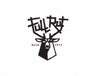
WIP. just a little something I'm working on with a new font I am trying to develop.
what ya think?
Status:
Work in progress
Viewed:
22213
Tags:
smart
•
thoughtful
•
BW
•
design
Share:
Lets Discuss
love the Mark Mikey, think the type is too much though?
ReplyHey BIG Mike, yeah you are probably right.
ReplyI just wanted something that stood out a bit. Something that made a person take an extra bit if time to explore the whole design. I could have gone with simple clean type, but just felt I wanted to explore this route. It really won\'t be a logo per say, but more of a piece of a promo design I\'m working on.
Your right though, the mark would stand out much more with cleaner type. But everyone does that!
HA!
Thanks man. I always appreciate your critiques, truly. They have always helped.
Cheers.
the letters looks some strange but I think it\'s good contrast
ReplyAnother winner Mike.
Replyi love the idea! nice
ReplyTomas, I\'m sure the owl and your chameleon will play nicely. :D THX!
ReplyRait, thanks for the feed back. yeah I just wanted to try something different.
Steve, cheers, bud. THX.
Gary, thanks, man. appreciate it!
Possible future mark change Mikey? Cos that bird is amazing!
ReplyTHX, Chanpion. I think I\'ll stick with the pencil/bulb, its worked for 34 years so far, so its kind of grown on me.
ReplyBut I hope to use this one with some material I\'m working on for a personal piece. So I hope to place it into action. Cheers.
One of your best definitely.
ReplyThanks for the nice compliment, Jovan.
ReplyAppreciate it!
I love your solution for the \'G\' everything is fantastic!
ReplyThanks, Nash. Still working on some of the letters for the whole set.
ReplyO and C are giving me the toughest challenge so far.
Good one!
ReplyPlease login/signup to make a comment, registration is easy