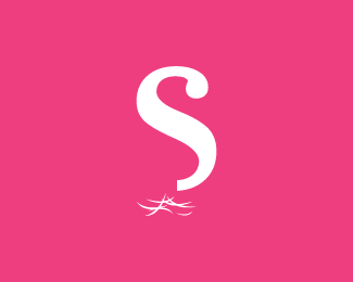
Float
(Floaters:
44 )
Description:
A design for a local Hair Stylist.
Status:
Client work
Viewed:
19885
Share:





Lets Discuss
very nice... I like it.
ReplyThanks jjjost :)
Replyneeds some off the top too!.. kiddin.. very clever mate.. very nice!
ReplyGood one, very clever! It's the type of logo %22doh! Why isn't that my idea!!%22 (something like that %3B-)
ReplyAwesome Hayes!
ReplyGreat concept, Hayes. Looking forward to the type.
ReplyClever, bud.
ReplyHeck, yes! This is great.
ReplyCool concept.
ReplyWow, thanks for the positive feedback everyone!!**Stay tuned for updates :)
ReplyUpdated%3B added typography %26 added some detail onto the 'S'.
ReplyAny comments on the update...?
Replyi think you should keep the update separate to the original...
ReplyNoted...
ReplyGday Hayes. Top idea mate! I would actually put strands of unruly hair here and there around the 'S' to make it less static. Just a thought mate. Nice type choice. It gives the hairdresser a quirky and refreshing feel.
ReplyThanks Norm, that's a actually a really good idea, I'll have a play with that today :)
Replyyou cut off Sandras mullet!**your so right Alex, damn i wish this was my idea! hahaha**great work Hayes. I really like that this hairdresser logo has no scissors or human heads but still communicates cutting hair so well. im a fan.
Replyha-ha yeah, de-mulleted indeed...**Cheers Melanger :)
ReplyI think the %22S%22 might be too big in relation to the hair. It's looking a little top-heavy. Or perhaps just a slightly thinner type. This is a very intriguing and well-concepted mark though.
ReplyThanks Spiffyj, there is an update that I'll be uploading once I finish the type treatment. That version I shifted the clippings down %26 slightly to the left which, balances it out. Cheers :)
ReplyThis really is coming along nicely. Can't wait for the finished product.
ReplyBravo Hayes... Clever! Looking forward to the typography...Good luck :)
ReplyThanks guys! New version is on its way :)
ReplyGreat concept.
ReplyThanks Wurdz :)
ReplySimple and elegant.
ReplyCheers Rudy :)
Replyinitially i thought that down there was water but after reading the info i realized that goes as well as hair. nice :)
ReplyThanks Tass!! :)
ReplyHayes Image, wow really inspiring.! very conceptual which i really like! Good stuff, keep it up!
ReplyThanks Moan!!
Replyi liked
ReplyPlease login/signup to make a comment, registration is easy