Description:
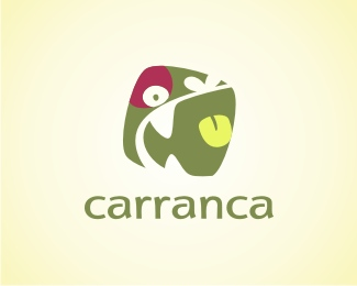
Carranca is a web design agency. "carranca" is the name of the wooden image used in the boats that sail the São Francisco river. The popular culture stand that this images scares the bad spirits, so the sailors cam have a peaceful journey
As seen on:
www.carranca.com.br
Status:
Client work
Viewed:
8863
Share:
Lets Discuss
Good work Sebastiany!
Replythis was a hard one. If you google CARRANCA you will see that is a agressive figure. We want to make it a more FUN version.
ReplyNice one-very good typo!
ReplyCool logo, Sebastiany! Just love it! %0D*
ReplyLove it. I recognized the imagery even before your explanation.
Replyexcellent idea, totally unique idea
ReplyVery original - like it a lot.
ReplyNice mark and typography.
ReplySo unique and lively!
ReplyThanks All!
ReplyVery unique indeed, fun to look at!
Replyreminds me of pissed off potato... like %22this one%22:http://photos-e.ak.fbcdn.net/hphotos-ak-snc1/hs232.snc1/7924_1226524631588_1483206500_30607204_3539080_n.jpg %3B%5D
ReplyI like this...
Replycaramba.
ReplyLove this one, unique mark and type.
Replyone of my favs, this logo rocks
ReplyI like this a lot, but it looks very similar to the character Aku from the Samurai Jack cartoon series. Might just be me though. Cool mark.
Replycool stuff
Replythanks all!!
ReplyVery Nice! Floated!
ReplyPlease login/signup to make a comment, registration is easy