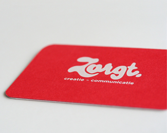
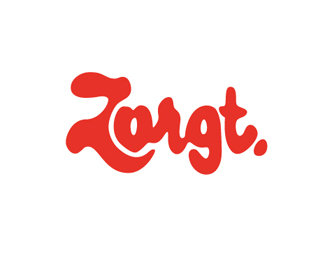
Zorgt
by rensdekker • Uploaded: Oct. 01 '10

Float
(Floaters:
24 )
Description:
Hand drawn logo for a Dutch communication agency.
As seen on:
Rens Dekker Communication Design
Status:
Client work
Viewed:
2029
Share:

Lets Discuss
I should have showed it to non-dutch people before. The dutch read it as Zorgt because they know the word and zargt doesn't exist in Dutch. I wanted the 'o' to be a heart as well because zorgen (zorgt) means 'to care'.*Thanks!
ReplyStill nice forms I don't speako Dutcho, so, can't have an opinion on legibility.
ReplyFresh, nice, I like it very much.
ReplyLet me say it's pretty legible Rens. Good to see another Dutchy here :)
ReplyFunky.
ReplyDutch aswell, and I read zorgt in the Thumbnail, zargt in full view. Ziet er goed uit %3B)
Replyvery nice start with your first three logos, curious to see more. good work :)
ReplyMaybe it might help to know Zorgt means 'cares' (second person singular of 'to care'). Now you can see why the Z is shaped around the 's' which is supposed to be a heart.
Reply%5E around the 'o' I mean of course :)
Replyyou can still have the heart shaped %22o%22 and clear the legibility my moving up the %22or%22 ligature.
Replyby moving, that is
ReplyI know no Dutch, but it definitely looks like %22Zargt%22 to my eye.
ReplyI want you to create the word 'Raja' like that :D***anyway!.. nice shapes and colour**
ReplyI lees 'zorgt'! Goed werk!
ReplyThis is so very, very lovely. Gorgeous work.
ReplyPlease login/signup to make a comment, registration is easy