Description:
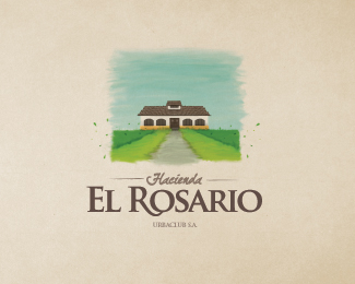
Its a painting (PS made) from the main entrance of the Hacienda, regarding its lively colors and ancient enviroment.
Status:
Work in progress
Viewed:
8816
Share:
Lets Discuss
i want this hung in my family room.
Replybriliant!
ReplyElegant !
Reply%5E%5E%5E%5E Thank you so much for your kind words...
ReplyVery good!
Reply%5E Much appreciated paul, thank you...
ReplyYeah! cool!
ReplyStellar stuff! Agree with Jonas.
ReplyEs realmente delicioso!
Reply%5E%5E%5E Brandsirrah thanks a lot for your comment, i have tremendous respect for your work, youre genius. *%5E%5E Thank you for your post vernics, your work is pretty stellar too!*%5E Your words are an honor sbdesign, im a big fan of your portfolio, thank you very much for your comment.*
ReplyFantastic work! So evocative!
Replythis painting is very charming
ReplyGran dise%F1o compa%F1ero!!
ReplyBeautiful!
Reply%5E%5E%5E :D, thanks raja!*%5E%5E Muchas gracias por tu comentario colega cpuentes, he visto tu trabajo, es muy interesante.*%5E Thanks a lot Tanami!
ReplyGreat news! Client loved the logo, just minor details to arrange! Its gonna be a clients work now!
ReplyPS made? Are these vectors?
ReplyNo milou, the painting and texture was made in Photoshop, everything else is a vector
Reply%5E were made, sorry...
ReplyI see, I was curious. Love it.
ReplyThank you so much Milou, you have amazing stuff in your portfolio, happy to receive your message.
Replysomething new, like look of this very much:)
ReplyThank you contrast! your work is awesome!
ReplyIm still trying to manage the vector result, but its not spot on yet. By the moment the client needs minor corporate pieces so i can take my time to make it work as a vector :D
ReplyBrilliant. Well executed! One of my favorites!**The small %22splatters%22 of %22paint%22 outside of the dark green on both sides look identical. Did you mean that? I would make the splats one side different to further establish the painted vibe.
Replylooks great awesome job..
ReplyBeautiful %26 elegant!
Reply%5E%5E%5E Thank you for your suggestion herby, i will surely consider it, but actually theyre not identical, but i was interested on giving it a symmetrical vib*
Reply%5E%5E Thank you so much sbj! i had fun with it :D
Reply%5E That was the goal epicantus, so glad it shows :)
Replywow!
ReplyPlease login/signup to make a comment, registration is easy