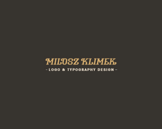
Description:
If you are here you probably think, again? wtf?
Yes, again... I will need to go on my with own name, because of setting my own business, which I don't want to call Milou. And with the law in Poland it will need to contain "Milosz Klimek" and the name of business "..." So that will be my personal identity, company name is in the works. Having hard times with it.
Any suggestions are more than welcome.
I'm not yet sure about the tagline.
For different bg you can go here: http://twitter.com/#!/mil_ou
As seen on:
twitter
Status:
Client work
Viewed:
2724
Share:


Lets Discuss
nice type you made here milosz, works for me:)
Replyyeah, think same:)
ReplyHey, thank you guys!*Florin, are you on Dribbble?
Replyi like this, a lot!
Replyno, not yet, i'm planning to, just been caught up
ReplyColin, glad that you do, cheers!*Florin, I've sent you an e-mail %3B)
ReplyVery nice type.
ReplyAgree, nice type, Milo. Cheers!
ReplyFun, fresh, Milou. :)
ReplyNick, Sean %26 Mike - You're too kind!
ReplyHere we go again...Kiddin:)*Nice type buddy and a very calming feel.
ReplyPadawan, how much do you charge yourself for these? :)
Reply%5E lol, good question...so?
ReplyReally like the main type. Only letter that stands out to me is that 'O'. Would it be weird if it didn't connect in the upper left of it? So it would start at the left side, end of that arm, then loop all the way around and then end with a rounded stub while it's on it's way back up. Just a thought.**The secondary text needs a little work, I think. The dots on the ends (I forget the actual name of them) feel much heavier than the rest of the type. I know they're the real point size for that type, but I'd still either bring those down a little or (preferably) bring up the type a little (not in point size but in value).**Very nice looking work, as usual! :)
ReplyTittle
ReplyRoko, Master, Florin - Hahaha! A lot of not-sleeping nights, that's for sure!*Nathan - check twitter bg linked above.
ReplyNathan - I like the way it is now, because it fills the light left from L, I'm not sure I understand what you mean with the edition. You say it should start with left down part and ends with right upper?
Replyyou have had so many great personal marks/identities/logos in the past (by looking at your showcase) and doing just one is hard enough. i'm curious though, why does your country require businesses to have full names? that seems odd, but i'm sure there is reasoning behind it.
ReplyPlease login/signup to make a comment, registration is easy