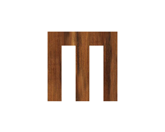
Blanco's Construction
by michaelspitz • Uploaded: Jun. 28 '09

Float
(Floaters:
12 )
Description:
Unused proposal for a general contractor.
Status:
Unused proposal
Viewed:
8,717
Share:


Lets Discuss
So this is a possible update to the previous version. Tightened up the text and switched the hanger over to the 'C'. Unfortunately I've had to pick up an additional text element (LIC%23) and it's added some extra clutter into the mix... I've attempted to integrate it in a number of ways, byline etc. This is the most recent variation utilizing an I-Beam of sorts...*Best,*Michael
Replyeven better!
ReplyI think you've managed to create a good looking logo here. Putting the licence %23 on the beam is a good solution.
Replynice job!!!
Replytass, cseven, bombbee...Thanks a lot!
ReplySeeing this logo made me sign up for an account just so I can comment on it! Absolutely love it! So many businesses in these types of industries have horrible brands, but this is fantastic! Nice job :)
Reply@serena: Wow, there's a compliment! Thanks so much! Very glad to have you!
ReplyPlease login/signup to make a comment, registration is easy