MICHAEL SPITZ : B/W1
by michaelspitz • Uploaded: Jan. 26 '10

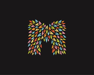
Float
(Floaters:
41 )
Description:
Personal Branding
(Primary Mark B/W)
>FULL IDENTITY SET: HERE
Copyright © 2010 Michael Spitz
All rights reserved.
As seen on:
www.michaelspitz.com
Status:
Client work
Viewed:
9105
Share:


Lets Discuss
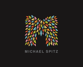
Spiky.. It%60s completely dif feel now. I like both versions.. and type is lovely, not sure about the leaf on the %60I%60 tho.
Reply@Wizemark - Yep, the negative filler in between is deffenitley a bit sharper over all, compared to the negative (or positive depending how you look at it..?) version I posted in color. Both versions seem to work out fairly well, so I'm thinking I might be able to play with both at once...**As for the 'I', the leaf could easily be lost... I was kind of swinging for a quick tie in, just in case I have to deal with a typographic standalone... Glad you like the type %3E I sweated over it for a nice chunk of the evening %3B)**Thanks a lot for the feedback!
Replymakes me think %22where the wild things are%22 for some reason.
Reply@logoboom - Ha! I could get into that... :)
ReplyLooks like a kind of furry pants :-D
Replynot very sure about the type, but the mark is damn cool!
Reply%5E agree with that. The Mark is so goddam cool its going kill any logotype and thats challenge in finding harmony in both. Don't get me wrong, the logotype is very nice, but methinks it will date in time (hand lettering is been used nearly everywhere in the creative world). So I'm going with a gut feeling of a newly cut serif (Veers Anubis Pro) would sit beautifully with this. Either way Michael fantastic work.
Reply%5E agree with that. The Mark is so goddam cool its going kill any logotype and thats the challenge in finding harmony in both. Don't get me wrong, the logotype is very nice, but methinks it will date in time (hand lettering is been used nearly everywhere in the creative world). So I'm going with a gut feeling of a newly cut serif (Veers Anubis Pro comes to mind) would sit beautifully with this. Either way Michael fantastic work.
Reply%5E sorry hit the wrong button twice :(
Reply@woelve - Ha!! Nope...I hadn't seen that...now it's totally stuck in my brain! %3B)**@andreiu - Thanks a lot! :) Type's still up in the air, so I'm working on it...**@mcddseven - Roger that. I seem to be getting a general feeling from people that they like the type (probably more as a standalone) in that that it either competes a bit too much with the mark, or like you're saying Paul...a certain limited 'staying' power if you will...I'll definitely take a look at 'Anubis' and give some more thought to the type solution overall.**In all likelihood, I'll be using the standalone mark more often than the logotype, but again, I definitely want something that compliments vs. competes...***LINK* %3E I've posted an initial mockup of some branding elements up on Flickr if anyone want's to have a peek..? :) %3Ca href%3D%22http://www.flickr.com/photos/michael-spitz/4308040884/%22%3EFLICKR%3C/a%3E Thing are obviously going to change a bit, but just throwing out some ideas...***%5EBTW - I hope Cris doesn't mind? But I borrowed his layout dimesions from 'the Floor' project %3E (just so damn aestheticly pleasing!) Rest assured it'll have a slightly more personal touch in the final set... Thanks %3Ca href%3D%22http://logopond.com/members/profile/showcase/8454%22%3ECris%3C/a%3E! **%5E%5E%5EThanks a bunch for the comments guys! Really appreciate the feedback! :)
ReplyNice looking stuff, Michael! Very cool. Just my 2 cents on the type if it's ok. I think it does distract from the mark. I really think that in this case the mark should steal the show and be the dominant element in your identity. What if you simply ran the type, perhaps even the same you have now, small and under the mark, the width of the mark - just small and sweet. I do think the hard edged nature and loose quality of the existing type does not reflect the mark so I would go for another type solution myself. Just some thoughts!
ReplyLovin' it. The colored leaves are fantastic. Reminds me of the Giving Tree by Shel Silverstein.
Reply@ethereal - Hey Sean! Your feedback's most certainly always welcome! :) I'll give the more minimal (sweet) approach a go...and see how that plays? Really pleased you like it! Good thoughts, thanks again! **@Thrasher317 - Thanks a lot! Another great parallel I'm more than happy to be associated with! %3B) Cheers!
ReplyAwesome!
Reply%5E what ethereal said.
Reply%5E%5EYeah, what Sean said!
Reply@ethereal / jn / JoePrince - Thanks a ton!! You guys rock! :)
ReplyNo problem, Michael, it looks great! It's very impressionable!
Reply@ethereal - Cheers Sean! Thanks again!
Reply%5E@ethereal - Sean, BTW - Definitely been digging your 'ethereal' update as well...very crisp! haven't seen an update pop up in you portfolio, but it's definitely caught my eye over to the side there %3B)
ReplyGood job man!*Love the id set as well%3B)
Reply@fourplus - Thanks a lot!! :)
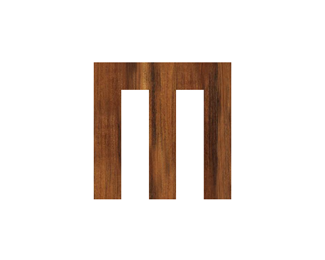
ReplyThis really rocks!, I love the carving look
Reply@jasho - Thanks very much!
ReplyLove this version!
Replywhat a beauty %5E%5E
ReplyYour logo is just so awesome, the colored version works incredibly well, i cant get it out of my head, it's a realy memorable logo :)
ReplyLove your personal mark man!:)
ReplyPlease login/signup to make a comment, registration is easy