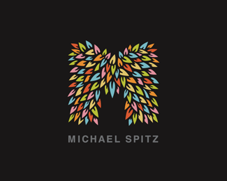
M : FINAL
by michaelspitz • Uploaded: Jan. 28 '10

Float
(Floaters:
48 )
Description:
Personal Branding
(Original Mark)
>FULL IDENTITY SET: HERE
Copyright © 2010 Michael Spitz
All rights reserved.
As seen on:
www.michaelspitz.com
Status:
Client work
Viewed:
7846
Share:


Lets Discuss
I love that
Reply@tabithakristen - Thanks a lot Tabitha! :)
Reply@absoludicrous - Ha! Thanks a lot Anthony! :)
Replyperfect Michael! Looks great, impressive own identity to show a client. Well done.
ReplyMore focus on a mark than with the previous type. Probably a good choice :-)
ReplyIdea - I would put all the emphasis on this wonderful mark and treat Michael Spitz part as the TM sign - small Helvetica style text in the upper right corner, probably in two rows as it is... Lower case... %3B)
Reply@mcdseven %26 woelve - Thanks so much guys!! Cheers!**@Type08 - Thanks Alen! Actually, the TM setup is one orientation I haven't tried yet... I went with the uppercase for a 'clearer read' on the small scale (since it's probably going to be that way most of the time)...but I'll definitely try that out and I'll see how it plays. Thanks a lot for the suggestion! %3B)
Reply*TYPE TEST***@Type08 - Alen, let me know what you think? I tried the lowercase back when I got started (but my name's a little tricky due to all of the ascenders etc.) so I think I'll probably stick with the Upper... I'm pretty happy with the other type, especially given the various scaled branding applications. But I suppose I could always use something like this as a mark identifier when it's just the mark on display?*
ReplySo you will try what Alen says, but not me, huh? Kidding. :) I Personally like this is better, the M just seems like it should be the dominant element with small type. I think you should at least try it under the M in one line, not stacked, the same width as the M. It would work out as a nice clean square then.
Replyit's moving!
ReplyAs I said, I like this better because this M mark can only be ruined with anything stronger then what you have now - it's your own fault that you did something that beautiful, now live with it! %3B) %3B)
Replyyou've got my vote with this one
Replybetter and better %5BM Club%5D!
Reply@ethereal - Ha! No, Sean, of course I tried it! Sorry you never got a demo... %3B) It didn't work with my previous type, but maybe it'll play with the Helvetica? I'll give a run :)**@raja - :) Cheers!**@Type08 - Ha! Trying my best to deal... %3B) I'm liking the simplicity of this %3E If I can make it play with the branding pieces, I think I'm might be set... (Of course again, at any scale much smaller than %5Ethis I'm I'm probably going to need alternate type...?) If we a slightly larger Helvetica works over the custom type I was working on, I'm willing to try it...**@birofunk - Thanks a lot! :)**@milou - HA! Right on! %5BM's Unite%5D! mmm... %3B)
Reply@ethereal - This update's for you my man! %3B) I'm kind of digging it!***Anybody have thoughts on a squared up version?
ReplyHa! :) Personally, I like this best, others and yourself my disagree and that's totally cool, you need to be happy with this. I just think it works, the symbol says it all here without the type competing or sticking out the side. Love to see this in the black and white too, bet that would look cool. I like it!
Reply%5EI agree. I'm liking this alignment the most.
ReplyYep, better! IMO this is it! Soopa doopa fly!
ReplyI'm signing for it too.
ReplySuch an awesome style. I keep coming back to look at it.
Reply@ethereal - Nope... %3B) I'm all on board! Think we might just have it here..!**@Type08 - Sweet!! :)**@milou - Cheers!**@Thrasher317 - Thanks again!***UPDATE* : B/W versions %3Ca href%3D%22http://logopond.com/gallery/detail/91616%22%3EHERE%3C/a%3E %26 %3Ca href%3D%22http://logopond.com/gallery/detail/91895%22%3EHERE%3C/a%3E
Replyi love this bush M - it has a feeling of something mysterious in a good way. I want to peep behind the leafs to look for something - maybe the design of Michael Spitz :) Good job ..
ReplyThis one is working the best. The smaller type allows for the mark to be at a larger scale, which is a good thing considering the detail and the fact that you just want to keep looking at it.
Reply@jn - Ha! Thanks again Jacob! %3B)**@OcularInk - Definitely agree, the minimal version was the way to go... Thanks very much! Really appreciate the thought!***%3E%3E%3E* I'm hard at work on the ID refresh tonight...so as soon I've got it, I'll post up the link and you guys can check it out!
ReplyAdmit it Michael, the inspiration came from Rijeka?:)
Reply@Rokac - HA!! %3B) What can I say... She is a wild and unforgiving land!
ReplyI stood and applauded. But you couldn't see that so I typed it, too. Love this!
ReplyI will definitely never forget this one. %3B)
Reply@chirp - Ha! Cheers Todd!! :) Many thanks indeed...!!!..!**@logomotive - Thanks so much Mike! Really means a lot! :)
ReplyFantastic again, here, the color is great!
Reply@ethereal - Thank you again kind sir! %3B)
ReplyWell... I think I'm just about ready to call it... %3B)*Thank you to everyone for all the brilliant feedback, and the truly excellent comments! *You guys rock!!* :)**%3E%3E%3Ca href%3D%22http://www.flickr.com/photos/michael-spitz/4308040884/%22%3E%3Cb%3EUPDATED ID Set HERE%3C/b%3E%3C/a%3E**%5ENext time I'm back in the states for a minute, I'm totally itching to have a go on a letterpress...%3Cbr%3EB/W sure... At 6 plus colors %3E yeah...we'll see about that...HA! %3B)**Thanks again guys! Cheers!!*M
ReplyEverything looks amazing. Get that printed on a small black shirt and I'll advertise for you %3DP But seriously, I'd love that on a shirt lol
ReplyHey i want a t-shirt too, it wont look as good on me as Tabi there, but hey it's still publicity :)
ReplyGreat %22M%22ark.
Replyperfect, say no more!
Reply@tabithakristen %26 javapp - %5EHA! %3B) Cheers guys! I definitely put it on the TODO list! :)**@acanski petar - Ha! Nice one! %3B) Thanks a lot!**@mcdseven - 'Tip of the hat to you my friend!' Thanks again!!
Replyyes, you nailed it! congrats for your personal mark. i wish i had one as good as yours. :)
Reply@andreiu - Thanks so much Andrei, you're too kind..! :) I personally love your mark! %3E It's a very strong monogram, and I definitely dig the pencil concept! %3B) Thanks again! Cheers!!**@thisGuy - Thanks very much! Really glad to hear you liked the ID set! :)
ReplyMichael, again really diggin this and your presentation.have you thought of doing a reduced leaves version for your avatar.? Just a thought.
Reply@logomotive - Indeed, the thought had definitely crossed my mind... I tested out several avatar versions yesterday...but getting one to translate clearly has been a little tricky... (I'm fully aware there are few scalability issues at this size, but save for that, the mark's meeting my needs very nicely) I'll put some time into a slightly detail reduced versions and see if I can't make it play a bit better at scale...**I'll post up some versions when I have them... Thanks again Mike! :)
ReplyThis just catches your eye in such a good way...kudos!
Reply@brandsimplicity - Thanks Fabian! Really appreciate it!***%3Cb%3EUPDATE%3C/b%3E*%3Cbr%3E@logomotive - Mike, I just uploaded the 'reducted' version I've been working on...and darn it if I don't like the way that one plays as well... Let me know what you think?**%3Ca href%3D%22http://logopond.com/gallery/detail/92137%22%3ELINK HERE%3C/a%3E
ReplyThis is really great, then I had a look at the complete brand on flickr and nearly had a heart attack! Wow your goooooood.
Reply@richardbaird - Richard, thank you so much!! I truly appreciate it! :)**Really happy you checked out the whole package up on Flickr! There are a few additional items I've been working on that have yet to go up...and I'll be sure to post an update when they launch!**Thanks again! Cheers! :)
ReplyI know others have requested, but definitely let me know if you ever decide to print this on a t-shirt. I will buy.
Reply@adambomb - No doubt! Definitely on the todo list. Thanks a lot for the pre-order %3B)
Reply%5E Hey Michael, this would look cool as an a3 poster aswell, the mark on plain black, if yer ever feeling generous and you want to give us ponders a little early christmas present... hint hint. %3B)
Reply@mcdseven - Wink wink, nudge nudge..! %3B)*Love to break this guy out as a screenprint... All of my equipment is back in the states at the moment %3E but a nice little art print is definitely on the todo list as well :)
ReplyPlease login/signup to make a comment, registration is easy