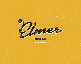
Description:
Based on recent feedback from the client, a direction like this might be suitable.
As seen on:
mabu.dk
Status:
Nothing set
Viewed:
24264
Share:





Lets Discuss
Dang Mads...you're type crazy..! %3B) Dig!
ReplyLove it mads love it :)
Replyvery nice treatment man!
ReplyYeah is great man!
ReplyI like it a lot!! :)
Replylove the type!
ReplyWoah guys. Beers on me.
ReplyBAMF! this is awesome!
Reply%5EBAMF is right! Your type work never lets me down, Mads. Always a joy to look at.
ReplyWow! type work are amazing, as usual. Brilliant Mabu!!
Replygreat typography! sweat. (as usual) :)
Replyfront page worthy
ReplyNice. Any reason to have Grill and Texas so small?
ReplyIt's great!
ReplyCheers guys!
ReplyKevin: Not really. I'll revise that issue and do a re-up. Thanks for the enlightenment.
ReplyNice Mabu. I wish I could do type like that. :)
ReplyOnly just seen this one, love it. The extra curl on the E is great
Reply%5E Yeah, this is definitely cool.
ReplyCheers gents! Much appreciated.
ReplyOooh.
ReplyWas this ever put to use?
ReplyBeautiful!*Very nice touch on %22E%22 letter.
ReplyI really like this one
Replytip top type work here mabu and i love the subtle texture.
ReplyNice work, balanced and graphically interesting!
Replynice work!!!
ReplyThis looks great! Love the texture, definitely adds to it.
Replynice type
ReplyPlease login/signup to make a comment, registration is easy