The Human Elements
by impodster • Uploaded: Feb. 21 '10 - Gallerized: Feb. '10

Float
(Floaters:
86 )
Description:
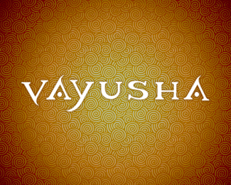
Repositioning my company - name, mark.
Status:
Nothing set
Viewed:
18570
Share:

Lets Discuss
Really awesome. The perspective is perfect and the colors have a great neo-tribal feel.
Replyforgot to comment. pretty good mark, nice perspective.
Replytrabalisious..:P love it
Replylove the shape and perspective of the mark..personally the colours are a little vivid for my liking
Replygorgeous, love the elements colours.
Replyvery very very very nice the logo**good luck
ReplyReally nice look!
ReplyNice work
ReplyAll - thanks for the comments! Glad you got the tribal/primative out of this. I almost included that in my explanation but left out to see if it translated w/o. **Any input on the name itself? I'm already settled on it but am curious about impressions.
Replywaoooo, really love this shape
Replyand the colors are geat
Replyoooh yeah you got the ball rolling - this is hot
ReplyThis jumped out as soon as the page loaded - great mark and lovely clean type!
Replythanks again for the floats and comments. first time on the board. didn't expect it.
ReplyI really don't like circular, step and repeat logos because they're easy to do in vector programs but it takes a bit more skill to do spherical 3d ones like yours.
Reply%5E I know what you mean Roy I feel exactly the same way. Seems it's a crutch in design IMO
ReplyI agree with your take on creating pattern for mere aesthetic apart from meaning.
ReplyNice colours! Very interesting illustration, looks like maya ornament :-)
ReplyEarth,fire and water...the core elements of life...SWEET!
ReplyVery nice symbol design, color palette and idea!*please, check my showcase... thnx
Replybrandsimplicity - good read - and life breath,air,spirit at center...
ReplyGreat colors, looks sweeeet!
ReplyGr8 0ne. Love it.
ReplyThe color combination you have used is awesome
ReplyPlease login/signup to make a comment, registration is easy