promessa
by eziemac • Uploaded: Sep. 11 '09 - Gallerized: Dec. '09

Float
(Floaters:
45 )
Description:
logotype i am working on for a client WIP
As seen on:
Euan Mackenzie.com
Status:
Unused proposal
Viewed:
12595
Share:


Lets Discuss
I like.
Replyvery cool. I like how all the letters seem to fit into eachother
ReplyComing along very well.
ReplyLooks real nice
ReplyLooks really good!
Replycheers lads :)
ReplyLooks promessing.
ReplyHAHA, do you really mean that or did you just say it for the pun :P
Replylooks very good... well done on that...
ReplyAny closer to a solution on this one, Euan?
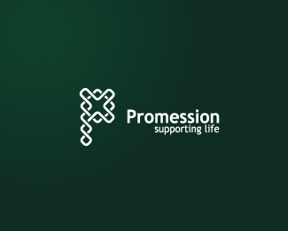
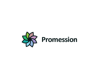
Replycheers Nido,**Im actually doing two logos for this client (the other being Promession) and im awaiting feedback on that one and looking to finish it before showing them any of the 'promessa' logos. One at a time!
ReplyThanks Nima :) Its got quite a while to go before its finished. Havn't worked on it for quite a while now, working on a different logo for the client first then i'll get back to this one.
Replyreally smooth typeface, gj!
ReplyI like it, typo and colouring too ... could You say what kind of business is this logo for? I am very interested if its not secret.
ReplyThanks fellas. **Its got quite a way to go yet and im sure purple won't be the final colour. I'll be going back to working on it quite soon so hopefully ill be able to show you the final outcome soon enough :)**sure Jan, http://www.promessa.se/index_en.asp I wouldn't take anything from the design of the website, they are a new business
ReplyEcological burial hmm, its first time i hear about something like that. deep violet is very good color choice IMHO. Its the last visible color on the visible spectrum, than it is ultra violet ... its very symbolic to the death .. and very nice colour too ... I am looking forward what will be definitive version and whole identity of this ... looking good at the moment.
ReplyIm actually doing two logos for this company. The other logo is called Promession which is the specific company that specializes in ecological burial. That logo is just about to get the thumbs up so i should upload it soon enough :)**I'm entirely sure about the difference between the two logos. Promessa is the clients company which have several similar projects such as Promession on the go
ReplyThe mark is headed in the right direction, but I would still tweak some things. I feel that if you're not going to run the letters over one another, they need a bit more breathing room. It feels a bit constricted, especially around the s's. Also, the curved serifs on %22p, r%22 and %22m%22 could be adjusted to parallel the bowl of the %22p%22(I think it's called a bowl, lol.) Basically the biggest spot that is bothering me is between the P and R. Remember it's just my opinion. Take it for what it's worth: Two cents. **It's looking real sharp. Good luck to you.
ReplyThanks for that, Nate. I have been working on it in the past (however i won't upload it until its complete) and funnily enough i have already done your suggestions! It looks better with a bit more space between the letters. I haven't showed the client it yet though.
Replyagree ... more space to give letters little breath, good point ...
Replyunfortunately the HQ in Sweden have decided to make a logo themselves.
ReplyPity. They chose one of your Promession logos though didn't they?
ReplyI was to make two logos for them. Promession was for the company that does the burials and Promessa runs several companies including Promession. I wasn't yet asked to start work on the Promessa logo yet and i did this when i had a bit of spare time so thats a pain! **They actually decided to use one of their own for Promession as well. My client is a bit gutted as she is the managing director and is based in Scotland yet has no say in these decisions made by the HQ in Sweden. I'm designing a website for Promession and i asked for the logo they are wanting to use for it and its rubbish! Such a shame when people don't realize the importance of a logo and decide to do something themselves. At least i got paid for that though!
ReplyWelcome to the thunderdome.%0D*%0D*Gutted for ya mate.
ReplySorry to hear that Eu. Glad you got paid for your time, though.
Replycheers lads. I actually have a good relationship with the client, hence why she hired me to make her website (its just those Swedish mugs!). Shes almost as gutted as me but she wants to try and find something to use it for :)**the annoying part is that this is basically finished and the difference between me getting some much needed %A3's and not getting those much needed %A3's was them saying %22I was inspired by what i did on my toilet break, lets roll with this%22 (not a direct quote)
ReplyReally nice type!
ReplyGreat work. Very smooth.
Replycheers guys :) i've actually improved on this since this was uploaded. I might update it if thats possible to do when its in the gallery?
Replyit is
Replyupdated!
Replywow! this is just phenomenal.
Replywow, thanks man :)
ReplyThanks man, im glad you and others like it, really gives me confidence with my work. Just gutted that its not in use, it was my first attempt at a logotype and it worked out quite well.
ReplyPlease login/signup to make a comment, registration is easy