Promessa.2
by eziemac • Uploaded: Oct. 23 '09

Float
(Floaters:
7 )
Description:
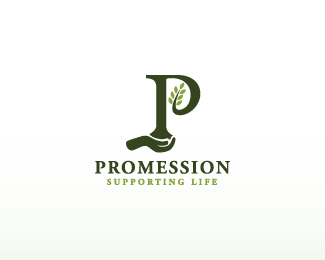
Another logotype im working on. Hand drawn.
As seen on:
www.euanmackenzie.com
Status:
Nothing set
Viewed:
3073
Share:


Lets Discuss
no one really liking this one then?
ReplyWe were trying to avoid saying anything... we had all been emailing each other privately in regards to this very design %26 didn't want to hurt your feelings... but then you had to ask..
Reply%5E haha, I liked the previous one better
Replynido LOL :-)
Replyhaha we're all friends here, Nido, just come out and say it in the future :P **Turns out i have lost the other logo (no idea how!) so i'm gonna have to re-draw it
ReplyI haven't responded yet because I was trying to think about what logo I like better. I really enjoy the cleanliness to this logo. If this is for the company that does the eco-friendly burials, then I would probably more inclined to go with this design. The green plays a great role and the custom type plays into the clean, careful and safe methods of the company. At the same time, I do feel that at times it looks like it might belong to a family of facial/beauty products. Nothing against you as a designer, it's just what my mind pairs it up with. The other logo, while awesome in it's own right, has a bit more, dare I say %22fun%22 in it that would probably not be associated with burials.
ReplyThrasher expressed it as I would ... I will add only that I think this logo has too much optimistic and %22growing grass%22 feel ... choosen type I have associated with cosmetics too, I thing my wife is using something with similar font on it ... sorry for critique my friend, logo is good looking but little off target audience IMHO ...
Replyand ... I feel very alive but when it comes I would like to be buried ecological way ... I like that idea, so I might be target audience ... this is horrible conversation :-)
Replycheers for the input lads :)**i agree with the client when they say they do not want the logo to have any references to death, they actually want it to be fresh and show life. In fact, they first wanted something with an almost graffiti style to it in two-tone. But they definitely don't want any association to death.**I can see where the cosmetics thought is coming from, it may be the square box outside.**haha maybe, Jan, although they insert the body with liquid nitrogen. The body then gets put ontop of a vibrating surface which turns the body to dust. Ouch! Theres just no easy way of doing eh? I'd personally like to be shot in to space :)
ReplyWhat I will say is this one looks pretty progressive. Maybe even a little techy. I agree with the cosmetics comments. The other one looks like it's shaking up the status quo, with a newer take on an old style of type (i.e. one with serifs). **The first version references life to me more than this style. Mostly because it's italicized and the serifs look like they have so much movement. I think they're both appropriate, just representing different takes.
ReplyWhile looking at the 'box', and hearing about burials, two images come to mind: the box reminds me of a coffin, and if this is about burials...why not have a 'horizon' incorporated in it in some way? %0D*%0D*Meaning, the name could be half way in a box-like/ground-like shape, and half of it could be poking out of it, at the top? Any type of shape %5Bnot necessarily box-like%5D could work here, imo. Even just a curved line cutting the word in two or some type of a shape with little hill-like imperfections at the top of it would convey ground I believe.%0D*%0D*The top half that's showing could look like new shoots of a plant. The bottom half %5Bwhether in a box/bordered shape or cut off by a line%5D could be dust-like, having a disintegrated look to it. %0D*%0D*If I could do a mock-up and show you, I'd even think of doing that to convey my idea%5Bs%5D. But, I think my words are relatively specific, %5Boxymoron, lol%5D...and I think you'll get my drift.%0D*%0D*Good luck with this one. This is definitely a new way to become the 'dust' in that oft-quoted verse, 'dust to dust'...%0D*%0D*And, by the way, I really like the typeface here. Very nice.%0D*
ReplyPlease login/signup to make a comment, registration is easy