Buffaleaux
by Type08 • Uploaded: Jun. 12 '09
Description:
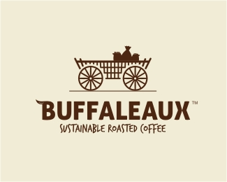
Final logo version for the Vietnamese coffee maker. We decided to pull out the tradition part of the vision: wooden cart carry bags of the coffee after the harvest, it is a symbol of natural, simple, people, country side and more. Logo is featured in a few books on logo design.
Status:
Client work
Viewed:
5325
Share:




Lets Discuss
I like it. Love the cart and type. Not sure you need the 'horns' on the B though. Might be too much and more distracting than readily identifiable.
ReplyThanks Darrel! It's still WIP, client loves that detail (makes the wordmark detachable again) but the horns might fall off in the final phase, we'll see! :)
ReplyI like the cart. I think you should simplify the text so the cart takes center stage. Right now your text competes with it. I really don't like the overly simplistic font used for the bottom line of text.
Replywhat about a 2 wheeled cart being pulled by a buffalo? i kind of agree with darrel on the little horn on the B. Like all the concepts Alen.
ReplyI'm with Trish. Love the cart. You did a great job there. But the type could be toned down some. Perhaps more of a %22traditional%22 font style with less weight would be a better fit. Either way, nice job Alen!
ReplyThanks a lot for all the comments. This is the 3rd concept of the logo I posted but there are 3 more I didn't and so far client loves the typography the most. Since it's going to be used detached a lot the B with the horn/leaf seemed like a nice touch to him. IMO, that detail extracted out of the wordmark could work as a very nice mark itself. Still waiting on the full impressions on this one, if it was up to me, the first concept was really the best and most original one, which you all confirmed with nice amount of feedback and votes. You know how it goes my friends... Thanks once again! :)
ReplyIllustration is so beautifuly done!
ReplyBeauty
ReplyOski and Lundeja, thanks a lot!
ReplyThis is very cool,digging the traditional spin.
ReplyAnother great logo Alen.*I agree with Darrel: drop the little horn. Otherwise very nice.
ReplyThanks Fabiano and Chris! :) I'll definitely post the final version after the adjustments I'll do with my client.
ReplyNice feeling, Alen.
ReplyThanks a lot for the support, mate! :)
Replyrealy nice alen :)
ReplyThanks Shylesh! :)
ReplyVery nice and warm.
ReplyThanks, Tass! With some color adjustments and slight changes this will be the final version, client loves it! :)
ReplyThank you, Nima!
ReplyVery nice and unique!
ReplyThanks, Bojan! With a minor tweaks, this is the version client loves the most!
ReplyToo sweeeet, nice job Alen.
ReplyThanks a lot, Felro! :)
ReplyProudly announce this being a final version of the logo for this Vietnamese coffee maker! Just finished designing the stationery package. Starbucks, watch your back! %3B)
Replynice style, i like this a lot %3B)
ReplyThanks a lot, Michal! Love your work!
ReplyPlease login/signup to make a comment, registration is easy