Description:
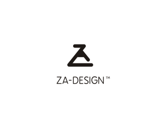
Re-branding and logo I have proposed to my European friend and fellow Logopondian, Jan Zabransky. Mark shows Z and A letters forming an pencil tip which draws the whole thing. Message: the design he does molds himself as a person as well! A bit universal message that could work for all of us here.
Status:
Unused proposal
Viewed:
3247
Share:


Lets Discuss
Can't say I've seen that before. Cool monogram!
ReplyThanks a lot, Kev!
ReplyCoolio. The first thing I saw from the thumbnail was a lab beaker - which actually goes with well with the creative designer concept.
ReplyThanks, Siah, definitely a bonus here - we are all maaaaddd scientists at the end! :)
ReplyThank You Alen, it seems to me more interesting day to day :-) I like the pencil is pointing upward. I remember upon this what Josiah wrote about his identity where he is using finger pointing upwards, too ... I had long time ago selfdrawing pencil idea in my mind, too ... Self branding is very very difficult discipline for me. I am impressed by identities as Brandclay or Siah design - I see deep spiritual meaning in it. I love strong symbolism in marks like Mikes Logomotive or Hlevetic brands and great style as yours graffity tag ... I really like it all. Looking forward for others comments here.
ReplyThank You Alen, it seems to me more interesting day to day :-) I like the pencil is pointing upward. I remember upon this what Josiah wrote about his identity where he is using finger pointing upwards, too ... I had long time ago selfdrawing pencil idea in my mind, too ... Self branding is very very difficult discipline for me. I am impressed by identities as Brandclay or Siah design - I see deep spiritual meaning in it. I love strong symbolism in marks like Mikes Logomotive or Hlevetic brands and great style as yours graffity tag ... I really like it all. Looking forward for others very appreciated comments here.
ReplyThanks Jan, I'm really glad that you like this. As we spoke offline, it was an instant idea and those can sometimes really impress with how nice they work. To be honest, I also expected more comments but seems like good Pond fellowship took a nap deez dayz... All good, really great designers have floated it so far... :)
ReplyLooks cool! As I said to you offpond, it would look great with a dash of color%3B)
ReplyThat would be up to Jan, I guessed he likes b/w stuff. :) Thanks Fabster!
ReplyPlease login/signup to make a comment, registration is easy