Ken L gazelle
by Logomotive • Uploaded: Mar. 08 '08 - Gallerized: Mar. '08
Description:
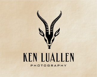
Logo created for a client that wanted a Gazelle for his mark to represent his different services. This mark works real nice in black and white, capturing the key characteristics and beauty of the gazelle.Modified type.
Status:
Nothing set
Viewed:
23899
Share:

Lets Discuss
Wow, what a wonderful style. Simply great.
ReplyThanks Art Machine.
ReplyNice one, Mike. A real beauty.
ReplyGreat execution although conceptually I don't understand it fully. Does he shoot wildlife scenes? This is not the same Ken L that does wedding photos, right?
Replythat is fantastic!
ReplyDache, yes that's the same Ken. He photos more than just weddings and wanted a gazelle so that's what I did. To be honest I get tired of seeing the same ol photography logos. I think by creating and elegant image, this captures the professionalism,beauty and quality in his work and hopefully stand out. I will also be doing other takes on the gazelle, so stay tuned.*Thanks guys!
ReplyMike, nice logo! I've been trying to reach you via your personal site and have been unsuccessful. Please contact me at: [email protected] at your earliest convenience.
ReplyLove it :)
Replylove it! great work!
Replyoops! nice.....
ReplyThat gazelle is awesome!
ReplyThanks everyone.*Alto I will try to get in contact ASAP.*
ReplyI love this mark and font. I might put this in my portfolio and pretend I did it.
Replyha ha Hobbs flattery, thanks,.. why not others have in the past, sure you can relate.
ReplyAwesome %26 strong!
Replythe best gazelle I've ever seen! and I've seen alot (don't ask).**@Logomotive, no fear that his mark will insinuate that he does wildlife photography only?
Replystunning!
ReplyThanks guys, ! onesummer, yeah that's what I thought also before I started this. Ken Likes it a lot but thinks he should try something else, time to kick it into second gear.
ReplyGreat symmetry. For some reason the 'photography' typeface seems a tad too contrasting. I like the juxtaposition in the types, but what about a rounder or condensed serif (ie: Garamond?) to set it off. Food for thought.
ReplyGreat illustration!!!!!
ReplyVery nice mark, appropriate typography, well done.
ReplyBeautiful details, how does it scale? Nice choice of type as well.
Replywow, you got one of the greatest showcases here. I'm a fan!!
ReplyBeautiful!%0D*%0D*I want something like these in a new logo i'm up with, if you can make me any suggestion i will be very grateful:%0D*%0D*http://logopond.com/gallery/detail/27474%0D*%0D*%3BD
ReplyThanky you VERY much to everyone. makes me happy.
ReplyBEAUTIFUL !**i love this logo
ReplyDamn sick. How's the detail when this is scaled down? It seems like you're going to loose quiet a bit in the horns.
Reply%5E%5E Thanks.*yes you will always lose some detail when scaling it down but this can be printed on the size of a stamp and still have enough detail in the highlights that it will not lose the overall effect of the rigid antlers. All things considered when designing.
ReplyHow come ALL your logo designs are SO wonderful, but your website is hideous? No disrespect. I envy these logos, they're gorgeous, but the web site... wow, I want to run. If you ever want a website to brag about I know some one who can help you out, and you won't have to spend a penny.%0D*%0D*Meanwhile... keep up the good work, your logos are the BEST! :)
Replythat gazelle is just fantastic
ReplyThanks for the nice words and not so nice words %3D)
ReplyThanks John.
ReplyBeautiful! Maaaan you\'re too good!
ReplyThanks Orca!
Replyreally fantastic%uFF01%uFF01%uFF01
ReplyThank YOU!
ReplyI know I said Thank you. What happened to all my comments?
ReplyPlease login/signup to make a comment, registration is easy