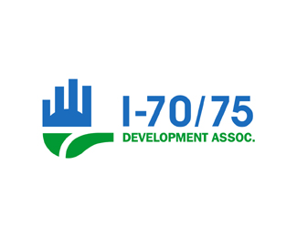
Description:
The I-70/75 Development Association is a membership organization made up of a broad consortium of community and business representatives from throughout the regions served by I-70 and I-75.
I -70 and 75 are connecting Interstates in Ohio Therefore the name 1-70/75. The Committee is Regional Strength,Economic Growth and Professional Development. I feel this logo conveys this well. WIP...wth
Status:
Nothing set
Viewed:
4746
Share:



Lets Discuss
good first draft. I see buildings which suggest development... I can see the No.7, hand outreached for welcoming membership, lots of meaning here. colors are solid.
ReplyThanks Paul. Hoping the Committee sees that :) The intersecting Interestates is how this idea came about.
ReplyI love the concept Mike. Lots of levels to this one, but it keeps the interstate central. The fingers/buildings seem a little awkward, but that's just me most likely.
ReplyThanks Chad, oh yes it could represent a hand and fingers too.. Added bonus. Never saw that. :))
Reply%5E that's the first thing i saw...i like the mark. although i think the i-70/75 is competing a little too much with it
ReplyThanks Colin, but Competing? How so?
Replyi think the i-70/75 is taking away from the awesome mark you have there, maybe too prominent. either way, this is pretty sweet. you're one hell of a designer.
ReplyNice work Mike! There is just one thing, which might just be a problem with me though %3B) : The hand seems like its representing a stop sign, while development should mean to continue. I like the overall concept, and your execution is great!
ReplyThanks guys, I appreciate your comment. Being voted on many committee members, so see how it goes.
Replygreat job! well done, clean, good colors, efficient. congrats!
ReplyWas this the only concept Mike?
ReplyOnly asking because I'm interested to see how else you spun this one.
ReplyAre you serious about NOT seeing the hand there, Mike? That was the first thing I saw. I don't see how that could have been an accident. A VERY happy one, if so.
Reply@Mike, are you taking the michael?:) first thing I saw was a hand that says welcome lets network here have a membership...
ReplyHey Mike, have you tried the mark on the right side of the type? That negative space in between the blue part of the mark and the I-70 type is sort of distracting.
ReplyCheers guys, not even going to make a comment until I hear back from committee. Other designs were submitted.
ReplySeriously.... I looked at it just coz I saw a hand first Mike :D. Seems like you're really good with using hands. Handy man %3B)
ReplyThanks Boetic Brands, The Stop sign hand was the main issue or concern, here so they went with a more conservative design. I can understand their concerns.**
ReplyNoetic :)
ReplyGosh I wish they would have chose this one. The hand is more High five or open hand than stop IMO.
ReplyChad, well here was the way it ended up. I liked my hand idea better but committee chose this proposal. http://www.i70-75.org/
ReplyPlease login/signup to make a comment, registration is easy