Description:
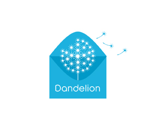
Another version for Dandelion. Tying in more of the "hallmark" aspect.Updated 09/07/10
Status:
Unused proposal
Viewed:
4436
Share:




Lets Discuss
Thanks brandsirrah, IMO I don't see how it ruins it. The business is about sending messages/cards etc.I find it fitting an approriate.
ReplyI would like to see brandsirrah's suggestion and maybe the font could match the weight of the flower.
Replygetting close to my vision here... Updated. Wanted to get that %22dreamy effect%22.
ReplyBeen a lot more challenging than I first envisioned.
Replynice dandelion. very nice. but I'm with the rest about the envelope. enough of association for sending messages/cards are the flying petals themself IMO...
ReplyAnthony, and rest. This is the clients request, so understand I'm doing my best, One day in my career I will be able to be just like you.
ReplyReally getting tired of your derogatory know it all attitude Anthony.
ReplyI was just about to say something like that. I'm no expert by any means, but I know not every design can be a visual pun with negative space and a witty name. I think the idea is coming along nicely Mike.
ReplyThank Chad. I appreciate the fact that you can grab the idea and concept and understand the fact that sometimes we have to do our best to cater to the clients requests.Sure I could come up with a simpler cooler more clever idea but the client feels the envelope or card is a must in the design and not just the seeds sending. I have put much thought into this project and trying to satisfy the clients wants and desires.
Replymakes feel like blowing and making a wish - that's dreamy to me
Reply%5E I knew you would understand and see the vision.
ReplyVisually not as good as it 'could' be...If you worry about coulds, if only's, etc you'll have an unfulfilled life...it's as good as 'needs' to be...which is far more important %3B)**Design is about solving a problem, based on that solution you make your image...too often it's done the other way round.**So with that, she may not be the prettiest girl in the club...but she makes me smile.
Replyyea, I like this revision
ReplyReally liking how you styled the dandelion. You created a really interesting effect. And in one color! That's difficult to do. I'd say you solved the problem well.
ReplyThanks Hayes,Steve and OC.*Antihny, I guess you just have a weird way with words and I don't understand you. Must be from a different generation I guess.
ReplyAnthony, to answer your question this is pretty much it, as you see it not experimenting with what it would look like etc.
ReplyFinal design. Just need to add the dot on i. OOPS client caught it not me :)
Reply%5ELol good answer.
ReplyWow, very nice!
ReplyI love the floating seeds :) Well done
ReplyThanks Fab and Jenny.
ReplyPlease login/signup to make a comment, registration is easy