LP // 03
by Muamer • Uploaded: Jun. 04 '15 - Gallerized: Jun. '15


Description:
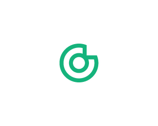
Outlined version only - with updated logotype // WIP // Plus more bright colors/backgrounds/variations, etc...
V01 with further explanation of the concept can be seen here: http://logopond.com/gallery/detail/232754
Have a nice weekend all of you :)
As seen on:
www.logopond.com
Status:
Work in progress
Viewed:
10503
Tags:
•
logo
•
concept
•
logopond
Share:

Lets Discuss
I do like how this baby looks. Nice Muamer!
ReplyLike I said, chicken dinner!
ReplyWell done mate.
type works on this one
ReplyI'm struggling with this guys, I realy do like this logo, but having now sanctioned this as a true client/designer relationship I dont feel right asking to use this as logoponds official identity. I cant properly compensate Muamer for his work,this was one of the reasons I took down lumavines work, sure I used my type with his concept, but it was still his cocenpt. I actually jsut changed the current one and took out the reference to ru ferets early logo also "i haven't uploaded that version yet"
ReplyBut truly, how do you feel about it Muamer?
This is great, the LP icon is spot on. I prefer this font as well. Nice to see some action back on the pond! Top work all round guys.
ReplyThis... is... it...
Reply^... ^... ^...
ReplyOn one hand, personally I think anybody taking the time to develop concepts for the new Logopond is doing so out of love for the site. It would be an honor to have created THE logo of all logos - and it's really huge for the portfolio, honestly.
ReplyHowever, we're a community. Set up a paypal or something. I like this enough to throw in, and if 10 or 20 people do the same, Logopond technically will be paying for his time and effort. If that is what it takes for David to be comfortable with this, I'm down. :)
Oh, and by the way, the colors! THESE are the colors!
ReplyWe are actually messing around with the type in the basecamp I have set up, just waiting for muamer to make a statement.
ReplyThis looks great.
ReplySpeaking as muamer's manager/agent/hero I would say he would be more than happy for you to use this and make all payments direct to my PayPal account.
@David, Everything is fine, you are more than welcome. Please don't think about any compensations. If you like this logo then feel free to use it.
Reply- If this logo became official logoponds identity - then I will be very honored and happy, that's all :))
Btw, typography in this version is completely custom made / it looks fine already imho, but some very fine adjustments still can be made...
@luberadesign: It's not about the money - it's about love! Thank you very much, but hey I don't think this is "the logo of all logos," - it is just a logo for logopond :)
Reply@nido: Thanks, my man :))
Thank you all once more.
1 for this logo/version.
ReplyVersion 2 is solid too.
@Maumer: I guess I meant it as a logo for the site that hosts all of the other logos, hahah. And yeah, I agree, it's about the love! But I know David has a difficult time accepting donated work. ;P Hahah. Either way, great job man. I hope this is used.
ReplyAlright, done deal, this is the new logopond mark, muamer look in the email i sent you for a basecamp invite, we have been looking at it over there also, Im trying to get some slightly different type but they are beating me up about it in there lol
ReplyGreat choice David.
ReplyCreative and solid work Muamer.
This is gonna look great on the site when completed.
YUS! Congrats Muamer and congrats Logopond. I think this could be the beginning of an exciting era. Davids teasing updates have me anxious to see the new version. :)
ReplyCongrats @Muamer!
Replywow, that's awesome! also congrats @Muamer with this amazing work, @ClimaxDesigns with nice choice and all with such great news! can't wait to see the updated logopond.
ReplyGrats Muamer!! Nice update.
Replywhat was finally settled on can be seen here https://goo.gl/VVJFGQ
Replythis is really great guys, this truly was a family affair, logoholik started with the outside the flower idea, which lumavine then took up with his pads in the o's which then muamer took up to make the pad but with the flower minimally/abstractly and type 08 and logoholic were the first to really see and woot woot the stroked icon. with a whole host of type ideas from Mike, Mikey, Sam, lubera and others.
ReplyLoved all of this. teary eyed. not back to the meat and potatoes of the redesign.
Yes! So great. Love that final solution. Does this mean that design-by-committee sometimes works?
ReplyAmazing work here. Sort of reminds one of Oguzan's logo here however: https://www.behance.net/gallery/2438595/Prospicience. Hope it won't be an issue in the future.
Replylmao Sam i ben thinking that but not wanting to say it all after noon.
Reply..... ah man say it aint so @akinom ... Devastated. crazy part is if you put his mark next to our text his mark works even better and more closely resembles a lilly pad
okay good I contacted the designer and he said its all good he said muamer as I actually a good friend of his so we're clear
Replyviva la logopond! :)
ReplyKudos to everyone!!
ReplyDavid, that link seems to be broken. Can you provide another one? I'm loving the updated mark, but I would love to see how the type is handled. I think there are a few inconsistencies with the type in this post, but I'm hesitant to make any suggestions before I see the update. Nice job, Muamer.
ReplyHmm click on it again its working for me
Replyhttps://asset1.basecamp.com/2953592/projects/9466893/attachments/159226399/ff2a0659388c3dfecb787fcabe5c5f590010/thumbnail.jpg
ReplyMuy bueno.
ReplyThis is great. Congrats both Muamer and Logopond!
ReplyAs David said, the new logo (from Behance) works even better. It clearly says LP
Still not working on my end. Are you able to send me an invitation to the discussion?
ReplyGood job guys, I'm more than glad that something is going on with the update of Logopond :) I'd like to join the discussion on basecamp as well.
Replysent to the three of you
ReplyThanks David, I'm reading all the comments right now.
ReplyCongrats Muamer
ReplySimply great work Muamer. Would love to join basecamp discussion
ReplySame here in regards to basecamp. Honestly haven't checked how that works. Do I need to have a paid account or just be invited?
ReplyGood work Muamer, gratz Logopond on a new logo;)
ReplyHow's the type coming? I have not read all basecamp comments. Feel Like the Type should mimic the Lily pad. Like the G especially maybe all Uppercase. Just my 2 cents.
Reply^ you could drag your 2 cents over there also :)
Replydon't need a paid account, just invited
ReplyTha mark remind me this http://kallorii.info/uploads/taginator/Jan-2013/recept-ponchikov-s-dyrkoj-po-seredine.jpg
Reply^ oh, no! Picked a wrong day to quit donuts, doh :)
ReplyIts so cool seeing all the different interpretations from so many different designers.
ReplyI decided to join in and design one myself.
So many great designers and so much inspiration. I love the simplicity of this mark. Pulls off the lily pad minimalism so well. And that color palette though!
I accidentally found this: https://dribbble.com/shots/2048733-e?list=buckets&offset=313
ReplyKinda like rounded corners.
@ru_ferret: Thanks for the link but that is more close to Oguzan's logo, then to this one... Just to clarify the design process once more please, first version was this: http://goo.gl/XI991c the second step/version is this outline: http://goo.gl/ObMbni - That can be clearly seen in the first post: http://logopond.com/gallery/detail/232754
Reply- The complete concept is based on simplicity and minimalism. The explanation of this logo/concept is also simple, it can fit in only one sentence >> The word "logo" is hidden inside simplified lilypad/flower.
I know, but I can hardly see the word "logo". Your personal mark is more clear, because we read and write from left to right.
ReplyI completely agree with Nikita here, as I mentioned in my lengthy Basecamp post last night.
ReplyAs much as I respect and admire Muamer's work, I feel like his rendition of the lily pad is way too generic. As we have now seen, from the other examples referenced, it's very easy for others to arrive at practically the same execution. I know Muamer didn't copy or steal anyone else's work, but this particular shape is just not unique. It's not special. Do we really want something so generic as the symbol for an inspiration site that prides itself in showcasing the best of the best in logo design?
Further, regarding the hidden word 'logo' in this mark, I see it only because it was pointed out, but it's a LONG stretch. In Muamer's personal mark, I very clearly see the word 'logo,' - and it's BRILLIANT. It's so clever, and it's one of my favorite examples of a logo that demonstrates such an effortless double-meaning. Each letter is its own unique shape within the face, but neither the face, nor the word are obstructed. However, in this lily pad mark, some letters share the same shapes, and thus, it's a much clunkier construction. Like, obviously, I see the middle O right off. But because of its construction, you're asking the viewer to see — in ONE SHAPE — an L, another O, and also a G. To see the G, you have to visually remove the vertical that creates the L. That's too complicated, and too much of a leap. It feels very forced, and I am certain no one would ever look at that mark and instinctively read 'logo.'
@ru_ferret, @atomicvibe: Thank you, I really appreciate your opinions. Interesting, it seems we have different points of view...
ReplyWell, if somebody cannot sees the word "logo" at first glance - that is OK, since it is hidden inside mark and it not need to be seen clearly - that is the point. Yes, we read and write from left to right but please don't forget that, beside reading, we also like to explore, to discover, to visualise...
"in this lily pad mark, some letters share the same shapes..." - yes, the same principle can be seen in this example: http://goo.gl/HTDXe0 - Toyota is well known brand with well known mark and yet very very few people knows / sees / that there is a hidden word "Toyota" inside the Toyota mark.
So, this mark here, like every other, has simple purpose - to mark, to identify, to symbolises, etc. For everything else there is a logotype which clearly says: logopond // from left to right // right.
There is no logo/design which can please everybody.
ReplyAfter all, it's not a rorschach test. I can see a stylised pad, but at the point of execution I prefer "Prospicience" or the one with round edges. P.S. As for me, the current logo has much more character, but that's another story.
ReplyI value your views... Different people like different things - and that is fine.
Reply"There is no logo/design which can please everybody. ... I value your views... Different people like different things - and that is fine. "
ReplyI second those two sentiments
You know what, I'm sorry Luma and Muamer, I'm not going to go with either logos, its time I grew a pair and stop letting people boss me around about the logo... I'm going to go with something that I created, so there's absolutely no room for 'trouble' down the road or hazey comparisons. I believe in your final piece Maumer, but I also don't want to have to defend 'someone elses work', if I'm going to have to battle it out in the foray of public opinion, I want to ride or die on something I created in my own brain.
ReplyI'm sorry for all the back and forth, but its time to start telling people no, about the logo.
David, no one's bossing you around. Considering this is a public site that values and encourages input and interaction (and the fact that you put this up for discussion here and on Basecamp) that is exactly what you are getting - from a group of creative professionals who specialize in branding and identity.
ReplyAs for you having to defend someone else's work, this is YOUR site, YOUR baby, and I wholeheartedly believe that regardless of whomever created it, you should be defending something you believe in. If that's Muamer's logo, or Luma's logo, or your own logo, as long as you believe in it, to hell with what other people think.
By no means am I invested in any of these alternate offerings, so my various critiques on Muamer's version here came from a completely objective, professional point of view. But despite my various reasons for not feeling this logo is appropriate, hey man, if you love it, then roll with it.
I used to Love My Duck.
Reply^ then you probably realized you outgrown it... we need to look at wider picture than just logo here... i stand by this one being the perfect solution out of all good solutions uploaded recently...
Reply@ClimaxDesign: David, the Logopond is your project and whatever you decide about it - will be respected... I wish you all the best!
ReplyDavid: I'm pretty sure everybody here has only the site and it's success in mind. Nobody is seeking personal glory or to make a dime off of this project, we're all putting forth creative ideas toward the betterment of the site. We all want to see a great Logopond!
ReplyI don't think anybody is bullying you or pushing you around. All of us are logo designers. It is our job (and therefore our natural inclination) to create solutions for image and brand problems. You of all people should understand that when you ask a question of this community, it's going to respond in many different ways, and that's alright! You don't need to feel pressured by one individual's opinion over another. But I think when the community responds as a group in favor of something, and it is clearly in line with the best interest of the site, then you should consider it without feeling like you are being pressured.
If you feel like you are "battling it out", then I think it is fair to say you are placing that pressure on yourself. A few days ago you were solidly in favor of this mark. It only took a few people voicing differing opinions for you to change that opinion. Like you yourself said, you CAN'T please everyone.
Heed the majority and work from there. You have the most incredible resource of input from the most creative and credible base of people, why would you throw that away because a few people disagree? This is clearly the most popular mark yet, and I'm sure those who would like to see changes are only saying that because they want to refine the idea even further.
You make the call, but please don't put aside all of the awesome input of the community you built just because it's not 'your own' work. Like Logoholik, I too stand behind this concept as far as what has been put forth thusfar. I would love to see you commit to it.
Oh, and also, we're all reasonable people, and I really think as a professional community we can have fun with this and hold ourselves above the internet forum drama that usually happens with this sort of thing. Let's not get dramatic, let's come together and make this an amazing time of change for the better on this site!
ReplyReally man, I think you do amazing work and you have some awesome changes to implement to bring this site into the future. Let's get past this stuff and you can move on!
Do a trial run with the new mark, and if after a month nothing new crops up, call it official. Or, just call it official and don't look back! I'm totally in favor of not mucking up the awesome community vibe of this site with a ton of dissension or argument. Do your thing!
Please login/signup to make a comment, registration is easy