LP // 01
by Muamer • Uploaded: Jun. 03 '15 - Gallerized: Jun. '15


Float
(Floaters:
55 )
Description:
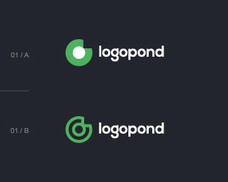
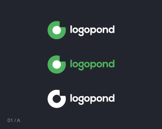
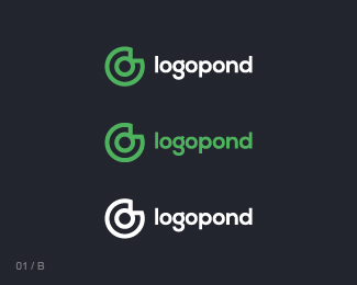
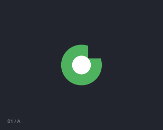
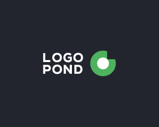
Version 01 / lowercase logotype.
My small contribution to the LP community, based on the recent Lumavine and David ideas, as well on uploads and comments of some other folks (btw, I already presented something similar to David by the email back in the 2014 but never share it online :| Anyway, now here is the basic concept: the LOGO - there is a hidden word "logo" which can be read inside the mark, in the same time the POND is presented by the very stylised and minimalistic "lilypad/flower"...
Simply the LOGOPOND :))
As seen on:
logopond.com
Status:
Work in progress
Viewed:
6857
Tags:
•
concept
•
logo
•
logopond
Share:
Lets Discuss
Winner! That's the symbol I'd love to see on a daily basis! I'd just revisit the logotype a bit, maybe simplify letter G, but symbol is spot on buddy!
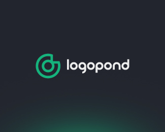
ReplyI would stick to 1b outline version, with actual thickness just a tad toned down and then i am with Alen on this :) I'd say it is about 90% to finished piece!
ReplyYeah, both are nice, but outlined version is nuts! 10/10 for the symbol, 8/10 for the text...
Replyholy sh*t, just now seeing the word logo spelled out by the mark... awesome
ReplyHey I thought the majority of us were against "Logo Contests?"" :)) Nice work Maumer!
ReplyNice the evolution of the lily pad, Muamer. Is this font Nexa?
Replywould a small yellow dot in center be overkill?
Reply^ yes :)
ReplyOutline version on white, please :) or one color on green :) bring the light, down with the black bg! :)
Reply@logomotive no contest here, i went back to original concept :D but its interesting to see where peoples minds go
Replynicce!!!
ReplyWhat if you put another circle around the whole outlined mark? That would be your second O for "logo", instead of using the inside circle twice for the two O's. It would also look like a ripple.
ReplyI change my vote to this piece. Wow! Love the linear version.
ReplyThank you all, it's nice to see that you like it! :)
Reply@type08: Thanks man, I will try to simplify that "g" letter inside the logotype, and will upload it sometime later...
@logomotive: No for the "logo contests!" But YES for the good old logopond! :))
@firebrand: Thank you. Yes, that is Nexa but I think that some additional custom tweaks will be needed there...
@logomotive: The yellow dot will be too much, imho, already tried that. After several different variations I'm back to this "less is more" version :)
@logoholik: Nice suggestions, man. Version with lighter colors is on the way. Thanks.
@samdemastrie: Hmm, I can give it a try maybe, but I'm not sure about that right now - since another "O" it will be additional graphic element (outside) and it will make the whole mark more complex... I'm trying to keep the things as minimal as possible... Btw, please check out this nice example over here: http://goo.gl/HTDXe0
@David: Yeah! Thank you for the logopond and thanks for the gallery spot :)
Peace!
I have to agree with all above.
ReplyOnce you see the liner version as a "L O G O " wordmark in the graphic shape of a lilly pad, that nails it for me.
Great simplistic approach Muamer
Yeah I'm not convinced it would work, just a thought I had. This is really great work, regardless. @Muamer
ReplyMy little comment was just like an aerial shot aspect including the yellow. I like this best so far.
Replymaybe someone try same concept but a little bit of points in center to look more like a flower? add a small yellow dot?
ReplyJust think it would capture the true essence of the original logo but simplified.
ReplySometimes less is not more. :)
Reply@Mikeymike: Thank you, much appreciated.
Reply@samdemastrie: Thanks, everything is OK :)
@logomotive: "Sometimes less is not more" - yeah, my man, many times (especially when it comes to money :)) or in making the good deeds...)
Love IT This is what Logopond used to be about.
ReplyHad a look at all the recent 'submissions' and have to say this is the chicken dinner!
ReplyThe outline version logo alone will bring this site back to the present and beyond.
Nice nice work Mr Muamer!
Love it as it is. Graet job Muamer!
ReplyIn love with the outline!
Replyvery cool!
Replythat's awesome, the outline version is my fave. minimalistic approach and communicates visually what a logo is about, great job!
ReplyThis is a very serious question that needs addressing: Has Muamer been featured? if not... why?
Reply^ I concur!!
ReplyPlease login/signup to make a comment, registration is easy