Colt
by YanaMakarevich • Uploaded: Nov. 13 '12 - Gallerized: Nov. '12
Description:
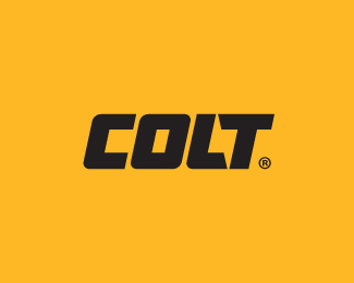
Power tools
Status:
Unused proposal
Viewed:
23519
Tags:
power
•
lettering
•
negative space
•
lightning
Share:

Lets Discuss
NICELY DONE, YANA!
Replycleverly negative space with the bolt.
superab negative space logo:)
ReplyThank you guys! Finally I\'m here)
ReplyLove that lightning bolt.
ReplyI love how subtle the bolt is!
Replyperfect ...
Replynice!
ReplyStrong and simple. Good work.
Replyhttp://dribbble.com/shots/816449-Bolt-logotype?list=popular&offset=6&page=2
Replylooks like yours was first
Replyyeah i commented on the logo referencing yours. i think dribbble gave it a \'coaches\' pick\' which is unfortunate.
ReplyThank you ColinTierney, I was surprised of this situation.
ReplyWhat does it mean \'coaches pick\'?
Yana, I commented on Dribbble but, I\'d like to say it here as well.
ReplyI personally prefer your execution to Fontfabric\'s on the Bolt word mark, regardless of who did it first. :)
Thank you, it easy, just look at the dates
Replyhttp://www.logomoose.com/logo-design/colt/
I was about to say \' i think it would look better if the crossbar on the t and and the l\'s slants were in the other direction\' then it hit me like ... a lighting bolt.
Replyagree with tabitha. your execution is far better imo. anyway, a coaches\' pick is when dribbble\'s admins announce something they like on dribbble via twitter. this allows for the designer\'s \'shot\' or post to get a lot more views and likes and slowly creep up the popularity page.
Replyamazing yeah!
ReplyVery subtle! Took me some time to see it.
ReplyYeah, that\'s quite a clever one, congrats! Where could I see the other one you guys are talking about? And cheers to everyone, it\'s been some time since I commented here.
ReplyThank you Lecart, the other logo was deleted by dribbble.
ReplyImpressive work, Yana. Glad to see the dribbble issue resolved so quickly with the minimal amount of blood spilled.
ReplyThank you!
ReplySo stoked to see this logo got featured here Yana. Kudos!
ReplyWhy did they not use this clients are eeeeeeediots. Awesome job!!!
ReplyMura, you can read about it on dribbble.
Reply^ I agree. So perfect for a power tool Co.
ReplyThis is awesome :) saw the bolt, great use of the negative space
ReplyNice work!
ReplyHey! your logos are great! ([email protected]) Im looking to get one made, if you would be interested please contact my email!
ReplyPlease login/signup to make a comment, registration is easy