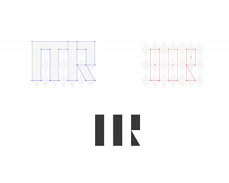
mr monogram / logo design
by tausendsasser • Uploaded: Jun. 29 '12

Float
(Floaters:
11 )
Description:
... unused Proposal for myself! inspiration from "VERGad"! love his color work ... ;D
Status:
Unused proposal
Viewed:
15644
Tags:
•
design
•
geometric
•
rothenburg
Share:


Lets Discuss
Type is difficult too read, I think it's too small. But it is interesting.
Replythat's right! difficult to read, so I've decided against that option.
Replywow! i'm loving this Marcel. stoked to see you exploring this style. both colours and gradients are very nicely handled. Nice work!
ReplyGreat recreation of that style!
ReplyPlease login/signup to make a comment, registration is easy