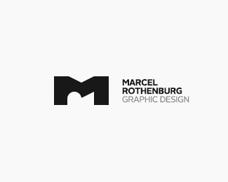
MR - Monogram (Marcel Rothenburg)
by tausendsasser • Uploaded: Jun. 16 '12
")

Float
(Floaters:
16 )
Description:
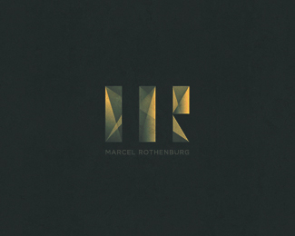
... simple clean logo/monogram for myself!
As seen on:
rothenburgdesign.de
Status:
Work in progress
Viewed:
11401
Tags:
white
•
black
•
clean
•
simple
Share:


Lets Discuss
...thanks watermarker!
ReplyI am my own biggest critic! ;)
da geht noch mehr ... da bin ich sicher !! ;D great start!
Replylove it!
Reply@TAS: .. weiniger ist manchmal mehr!;D ... and thanks!
Reply@Artist: thx! :D
Many thanks for your attention! The design of "mratajczak" I do not know and I must confess that I only vaguely similar. Grasp the idea of ȀBȀBthe letter R in the M had been many - there was "mratajczak" certainly not the first! The implementation of my initials and Monograms is completely different and should not need much discussion ...
ReplySorry for my bad English;)
same initials ... same idea ... different results! Or I see something wrong here?
ReplyThe basic thought and the unique idea of my version is entirely different. I've done it with only a small graphical finesse the letter "R" to bring to bear. mratajczak has to complete. Letter "R" in the "M" Intergrated.
ReplyAs a personal opinion, I prefer this execution of the monogram. But, I think the 2 monograms are different enough to coexist. If Marcel's inner "R" had been upright, I wouldn't say so.
ReplyPlease login/signup to make a comment, registration is easy