FWBT_WIP_1
by Mikeymike • Uploaded: Dec. 09 '11 - Gallerized: Dec. '11

Float
(Floaters:
94 )
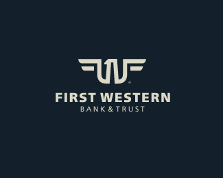
Description:
WIP.
concept for a bank.
trying to get a "W", "F" and a "1" in the design.
also has a feel of and eagle. (I think, anyway.)
thoughts?
Status:
Work in progress
Viewed:
6102
Share:

Lets Discuss
mmmhmm...that's nice
ReplyLooks great Mike - I saw the eagle, w %26 f too.
ReplyYES! 1/WF NICE MIKE LOVE it!
ReplyThanks guys.
ReplyBG sucks though. %3BP
ReplyDef this one!
Replythere you go Mike, changed out that background. :D
ReplyHey, Mike! Sorry I missed the days events. :) You have been doing a lot of work on this one. This is great! This one here is fantastic, it has it all, very clever! Love the graphic, and the type is a great fit and the best of all your variations. Great work! If your client doesn't go with this then they don't have a clue.
ReplyYou mean Funkmaster Flex, David? I see the F wings but it's quite different. They are all copying Van Halen anyway! :)
ReplyGreat work*
Replylove love love
ReplyYou've nailed to mix all the 3 letters into a strong mark, great job!
Reply* 2 letters, 1 number :)
ReplyIncredible final result!
ReplyGREAT work !
Replywinner:)
ReplyAwesome work, Mikey. I can spot everything in this beautiful form of sign!
ReplyI see the eagle...
ReplyWow! Cool DesSign %3D)
ReplyThis is a great design and I saw everything you were trying to accomplish. I don't know that this works on a national scale though, as it is a bit too detailed. Looks more like a local credit union look. There seems to be a trend towards a smoother cleaner minimalism with the bigger banks, (ally, union bank of california). Don't get me wrong this is clean, it just comes off a touch too intricate.
ReplyWOW! Thanks so much for the response on this one. And thanks for the gallery spot. Have a couple more concepts I may load here and get some feed back, but I show client later next week. Hope they chose one of the designs. they have been a client for quite some time, but this is the first time we have gotten the chance to change their logo, which they have really needed to do for quite some time now.*Thanks again for the feed back, really appreciate it.*David, I have no ides who Funkmaster Flex is. :) but I do know Van Halen. HA! all in good fun.*Guess I got to get out more.:)*@ Van Paul, yeah this is a smaller local bank but they are expanding. I do have more concepts with simpler designs, so I hope I'm covered.*Cheers all.
Replybrilliant!
ReplyG ... wow ... didn't expect anything else ... !
ReplyThis is totally awesome! hats off Mike.
Reply:D @ David, I hear yeah. Love all kinds of music, just can't hear it all.*Dan, thanks man.*Bernd, thanks, bud.*Rudy, appreciate the comment. Big time.
Replysophisticated...digz mikey
ReplyThanks, Nitish.
ReplyTough :)
ReplyLOL, not even close: http://www.auto-logo.info/logo/ford_expedition_funkmaster_flex_edition%25282008%2529.jpg*
ReplyFantastic work. Definitely the best version so far.
ReplyIs perfect!! Love it Mike!!
Replythanks, guys. means a lot. showing concepts next week, or so.
ReplyLove the eagle :)
ReplyThank you, Bayu!
ReplyI would switch to this bank based solely on the logo. Outstanding!
ReplyThanks for that comment, Robert. this Bank would love to have ya! :D
ReplyYes, I saw the works (W, F and 1) all incorporated in the eagle. Seriously sweet mark. Congrats! What did the client choose?
Replythanks, Ashley. The client is still out. amazing right, I had to turn it around quickly and now they are taking their sweet time. :D*This on and the two others I have posted are all still in the hunt. I have a feeling the simpler concept of the eagle, %22W%22 %22F%22 and the %221%22 will get the thumbs up, but we'll see.
Replythis is simply humbling...
ReplyMidgar, thanks so much.*Just got word the client is NOT going this route. DAMN!*Oh well.
ReplyPlease login/signup to make a comment, registration is easy