Float
(Floaters:
12 )
Description:
revised and older design. Just for some fun.
Status:
Just for fun
Viewed:
3169
Share:




Lets Discuss
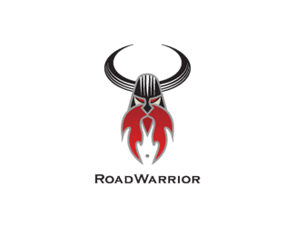
Updated: took off the grey outline on the type and horns.
Reply!!!
ReplyOne hell of a badass!
ReplyBernd....thanks bud.*Gert, BAD ASS is his name. :D
ReplyCompletely missed this. The fire beard is awesome.
Replynice, i also see a face within that magical facial hair...
Replythanks, Sean.*You also Colin.*say everyone sees the helmet is the top of a motorcycle tire and the horns are also a tire, right? No one mentioned it, so I'm just checking to make sure people see it.*cheers.
ReplyI didn't see that but even better. I love easter eggs.
ReplyCrap, I didn't see the tires either but now it seems so obvious. You could experiment with a different tread/pattern on the tires, that might give more of a cue.
ReplyAaaHH HA! Glen, love the %22I love Easter Eggs%22. made me laugh. Dig that random humor.**Sean, I guess I need to work on it then. Can't believe no one saw the tire influence. Damn..got to work on that then. I thought the tread might get lost when taken down.*But I am now thinking of this for a t-shirt design, so i have more visual room to play with that tread.*Wow.. I am still shocked people didn't notice.. Goes to show when a designer works on something so long he (or she) see's everything. And then we are so shocked no one else is seeing it. *Good info though, now I know I have to go back in and work on it.*No wonder the tire didn't go there for the logo.*cheers.
ReplyPlease login/signup to make a comment, registration is easy