Jebro Joe
by Mikeymike • Uploaded: Oct. 24 '11 - Gallerized: Oct. '11
Description:
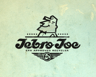
unused concept that I am reworking for some fun, for now. May use it for something down the road. Original client was a company that collected used motor oil and recycled it. they also wanted a mascot. I ended up doing the final logo, its just not this one. Wasn't real happy with the committee dictated design we ended up with.
"Jebro Joe" is a hand done type I thought gave it a fresh-retro feel.
Status:
Unused proposal
Viewed:
8071
Share:





Lets Discuss
mike, that type is sweeet.
ReplyAgree, this style is sooo unique %3B)
Replym a s t e r p i e c e !
ReplyColin, thanks, man.*tieatie, thank to you also, appreciate it.**B E R N D ! t h x ! :D
Replythx for the gallery post. always appreciate it.
ReplyAgree with these guys! The style utilized fits really well and the custom type just brings it all together so nicely.
ReplyGURU!
ReplyWay to go Mikey! This is great.
ReplyFAV ))
Replycool style )
ReplyLove the style of the character, and the halftone stubble.
Replyaviat, thank you.*jk, too kind, thx.*Roko, always nice to get your feed back. thanks.*beshur, thx.*artemix, thank you, sir.*jeffrey, big high five to you man, thanks.
ReplyStill love that type!
Replysomething different from you, very nice:)
ReplySean, thanks, bud.*Deividas,, different is good. :D Thanks.
ReplyThe stubble is awesome! Really nice logo Mike.
Replythanks, Steve. there always a 5 o'clock shadow somewhere.:D
ReplyVery retro cool Big Mike. Nice job.*
ReplyLove it.. great logo design
ReplyA great retro style!
Replylooking as some general Kastro or Ratko Mladic
Replywell thank you, bigger MIKE. :D appreciate it. Its like getting praise from Yoda. cheers.*logo design, thanks.*Artgeko, so glad I made the retro look work, thanks for liking.*Agencija, well that's because he's proud of ridding the world of bad oil one gallon at a time. :D Thanks.
Replyso cool! i love the line.
Replythanks, diana. went to your web site, really enjoy your illustration style.
ReplyReally good!!
Replythx, angel.
ReplyDude without worries. Cool retro work Mike.
Replybig thanks, Jovan. Retro was the angle I was going for, glad that people feel I got there with this. cheers.
ReplyThis is awesome. Would love it on a shirt!
Replyperfect!
ReplyCraig, thanks for the comment. Yeah I might have to change it out a bit and do something on a shirt. THX.*Thanks to you also, peg. cheers.
Replyit's perfect, FLOAT!
Reply:D thx, Rick.
Replythank you, szende.
ReplyPlease login/signup to make a comment, registration is easy