Description:
WIP.
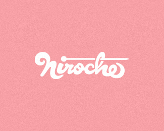
while working on my nuclear stars project I worked on this word mark. Just liked the way the type was turning out. Hope you feel the same.
Status:
Work in progress
Viewed:
4046
Share:


Lets Discuss
nice %3B%5D
Replythanks, Jands.
ReplyCool letters.
Replynice type :o)
ReplyNick, thanks for the comment. appreciate it.*Thanks, Hossein.
ReplyLike where this is going, Mikey. Although letter %22A%22 seems a bit off the balance,but maybe that's just me:)
Replygreat type mike
ReplyPretty darned interesting. What if the top part of R extended out to the left a tad?
Replywhat really impressed me is the mass of great design concepts for this nuclear thing ...
ReplyRoko, thanks, bud. Yeah it does feel like it is leaning a tad to the left. I'll check it out.*Edgar, thank, man.*Glen, nice you should mention that, I had it that way, but some thought it didn't match the %22T%22. I did like it a tad extended, we'll see. thanks for taking the time to comment, really appreciate it.*Bernd, thanks for watching and pitching in with comments with all the concepts. That really helps. appreciate it big time. cheers.
ReplyUPDATED: straightened out the %22A%22
ReplyPlease login/signup to make a comment, registration is easy