
Description:
WIP_3
other version is here. http://logopond.com/gallery/detail/146448
and here: http://logopond.com/gallery/detail/149025
Status:
Work in progress
Viewed:
8063
Share:

Lets Discuss
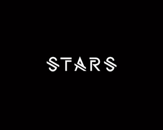
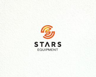
Because this client is still considering names I have taken the secondary part of the name off for now.*But I think I'm getting closer to a solution that I think works for a nuclear looking %22S%22.*Hope so any way.
ReplyThe mark is looking really nice. I think this is the best version yet.
ReplyThanks, Nick. Yeah I think so. Its simpler and still says atom to me, so that's usually good.*Now type and another direction or two, to make sure I haven't leave any design stone unturned. :D.
ReplyThis is much much better! Looking great!
Replylooks good
Replynow I know exactly where I have to put my eyes on ... awesomeness !!
ReplyNathan, agree thanks to everyone for the insights.*Oleg, thanks.*Bernd, agree. its funny simpler is always better, just hard to get there sometimes. cheers, bud.
Replythat A works out super conveniently! very cool!
ReplyDanny and Lefty, thanks guys. :D
ReplyGodd job, Mikey!
Replynice to hear from ya, Nikita. THX
ReplyLike I had mentioned over Dribbble, the simplification is fantastic, Mike. Nice job, man.
Reply5 Stars mate.
ReplySean, always like to hear your kind words. thanks man.*Chanpion, 5 :D :D :D :D :D.
Replywow, the best version in my opinion.
ReplyColin and Justin, thanks guys.*Hope the client goes for this one. I'll find out in a week or so.
ReplyI really, really love that mark.
ReplyI really, really love it when you say that. I just got word today that they are leaning this way. know more next week. Damn, I hope they go this direction. Cheers, Glen.
ReplyPlease login/signup to make a comment, registration is easy