TH Design
by JustTomTom • Uploaded: Sep. 09 '11

Float
(Floaters:
2 )
Description:
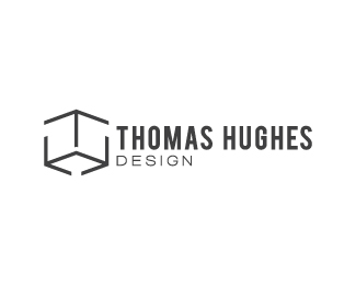
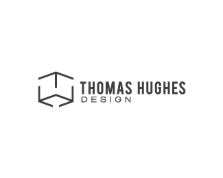
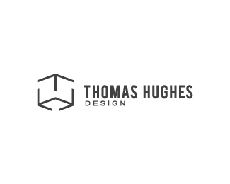
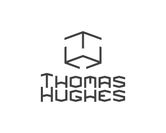
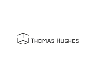
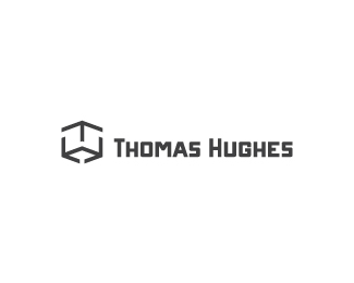
Still working on my personal identity, but now I'm experimenting with some type made from scratch to help better match the mark. I don't think it turns out well at a small size though. It's my first time trying custom type too so I'd love to know if you like it or find it horrendous! I'll upload another version where the type is clearer too.
Status:
Work in progress
Viewed:
1333
Share:
Lets Discuss
You think so? I suppose you're right about it working if the type is smaller than the mark, since they're meant to be similar and if they're about the same size then they might blend into each other too much.**Thanks for that! I'll see if I can work on the type some more though. Something about it at this size still feels off to me.
ReplyLove the size here, and actually like that you dropped design completely. Good call if you ask me. **However, that type is whack, homie (sorry just watched an MC Hammer video on youtube)! What I mean is that it is competing with the mark too much. You want the mark to be the focal point and for the type to support it. Honestly, I'd say pick a classic font and stick with it (and maybe kick it down to a grey instead of black), such as Helvetica Neue, Akzidenz-Grotesk, Univers, Avenir, etc. **Clean is cool!
ReplyYeah. It just felt like it was 'hanging' there and it was annoying to try and balance it out with everything else.**Yo, you be dissing mah type bro? Well.. putting out ghetto selves aside, I don't find that surprising. I'm glad to hear whether it sucks or not. It seems I've got to keep trying when it comes custom type, since it's actually a LOT of fun sketching each individual letter out! :D I accidentally created another font while I was at it.**I was curious about what people thought when it came to making the mark and type 'too' similar. I'll have a look at some existing fonts and stop trying to make a volcano out of a molehill. Thanks once again for your continuos help! :D
Replyi agree. the type is competing too much with the mark. it should correlate but still be simple enough so it's not dominating. once again, great attitude towards everything and i promise, if you keep this up you will eventually have a winner!
ReplyThank you Colin :). I'll definitely come up with a winner! I just have no idea when that day might be haha!
ReplyPlease login/signup to make a comment, registration is easy