TH Design
by JustTomTom • Uploaded: Sep. 07 '11

Float
(Floaters:
0 )
Description:
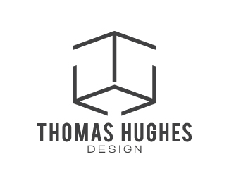
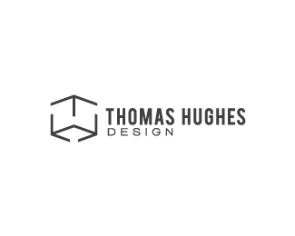
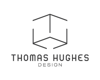
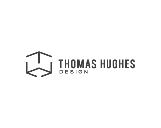
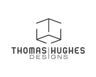
Another suggestion given to me for my personal identity mark was to try it in this layout, which I kinda like actually. Still a work in progress though.
Status:
Work in progress
Viewed:
1531
Share:
Lets Discuss
You are getting closer by each version Thomas! This one I agree is the better version with the text on the right. Now imo, the mark is still abit off and you would probably still feel the same. It still lacks dimension. Maybe try making the lines even bolder by approx half the thickness and try to incorporate the same spacing between the line breaks. The size ratio between the mark and the text I think is perfect but give the text some breathing room. Atm its abit too snugged up against the mark. I'm still not convinced about the font choice though. Great call on the DESIGN bit by Nathan on the previous version. Overall you are another step forward in the right direction but if your head starts to hurt, put it down and let it rest for a little. Come back later and you might have a fresher approach! Cheers.
ReplyYup, think you're getting there and agree with what chanpion is saying. I'd bring the whole thing down in size quite a bit so that you can give some air between the mark and the type. When you reduce the size, 'design' may become a little hard to read. You could maybe change it to a slightly bolder cut, make it grey (maybe 70%25), and slightly track it out a little more. Also, you'll notice here that optically the 'D' of design appears to stick out to the left a little bit. Try aligning it to the trunk of the 'T' to fix that. Lookin good!
ReplyWow! Such helpful crits from not one but two of you! I'm glad I'm heading in the right direction at least :). I'll try out all of your suggestions, since they all seem to make sense. I was also thinking about it lacking dimension too, but was a bit worried about making it 'too' thick to help with that. I'll try it out anyway though.**Thanks once again guys for all the help! It's appreciated on a gargantuan proportion! It's interesting how these suggestions are all rather small details and yet add to the design so much too.
Replyalways glad to help, and so refreshing to hear somebody willing to listen to suggestions instead of defending their work. People only want to help. Good luck, friend!
ReplyPlease login/signup to make a comment, registration is easy