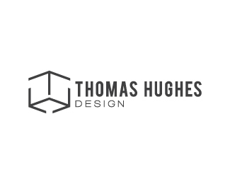
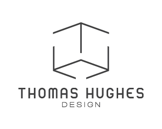
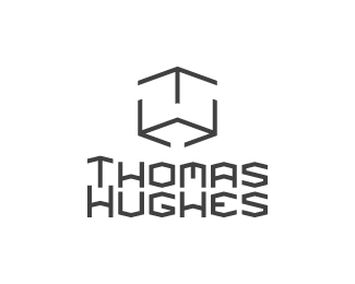
TH Design
by JustTomTom • Uploaded: Sep. 09 '11

Float
(Floaters:
2 )
Description:
Yet another revision of my personal identity mark. As suggested I could thicken the mark so it has more dimension, but I've not found an appropriate typeface yet to match the thickness of that. While I search for some better ones I'm thinking of having a go at custom type to match the mark, but I've never tried that. I think it would help make it that bit more personal though and I wouldn't be so constrained!
Status:
Work in progress
Viewed:
1413
Share:
Lets Discuss
thomas you've come a long way with this. and your take on criticism has given you an opportunity to improve yourself. i respect that.
ReplyOoo yeah, this is starting to work well! Maybe a touch more space between the mark and the type! I don't have a problem with the main type, but I think you could modify it a little bit to make it your own! Print it out a bunch of times and go over it with tracing paper, changing things here and there! I still think 'design' could go a little smaller so that it's not the same exact width as 'thomas'. Right now i can see it being mistakenly read as 'thomas design hughes'**Lookin great, friend!!
ReplyThank you so much for such a lovely array of words! I stopped being needlessly defensive a long time ago, since it just prevents progress. Besides, I'm still at that stage where I've got a LOT to learn! I should be grateful that more experienced and knowledgeable designers are offering me their thoughts.*
ReplyAhhh I'm glad you're liking how it's coming along Nathan! I see what you mean by the reading order, so I best change that to avoid any mistakes. I'm still not sure how I feel about the type though, which I think is because that it's on two lines. I may see how it all looks on one line at a smaller size instead.**I really like that way of modifying existing type! I'll give that a try along with my other little experiments. Thanks as always for your help! :D
Reply%22experiment%22**best word a designer can know. Good for you %3B)
ReplyIt 'is' where all the madness and chaos occurs after all :). I love the madness!
ReplyI like the balance in this. Except for....%22design%22. Looks squished. A lighter weight font, but a narrow font, would be a good fit for that.**Personally speaking, a personal identity is hell to create. Good luck with it.
ReplyYeah, the font is a little stretched. I don't know why I didn't bother changing it in the first place haha! Thanks for the help :).**We're our own worst enemies. I have already gone through a few variations of hell with this, but even if I managed to finish it I still have other completely different ideas to choose from! GAAH!!*
ReplyI definitely like how this is progressing Tom! What all the others suggested are spot on too. I would even dare you to tighten the spaces/breaks a little more on the mark and even go a little bolder on the linework. It would look great reversed when the situation arises. I can see this mark already looking pretty kool on stationery. But like I said, don't force it out. Let it rest for a couple of days or weeks even. You'll be surprised at all the new angles you can come up with! Cheers and keep up the fantastic job.
ReplyPlease login/signup to make a comment, registration is easy