Mond of Copenhagen
by mr.purple • Uploaded: Aug. 11 '11
Description:
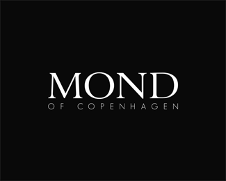
Logo for a Danish fashion brand, selling highest quality tailormade suits, shirts and accessories - this is the version they accepted and decided to use.
Status:
Client work
Viewed:
3365
Tags:
minimal
•
style
•
fashion
Share:

Lets Discuss
strong. like it
Replykind of like it, but you need to fix kerning.
ReplyCheers qyper!**Thank you for your comment, Deividas, much appreciated! I presume you refer to the kerning of 'MOND'- I will try some variations. My goal here is to learn as much as possible. I'm not a designer by profession so any comment is welcome, may it be negative or positive.
Replytry to make spaces visual same between letters, now i read M O ND
ReplyLogo updated - kerning fixed. Sorry for the late response, thanks again Deividas!
ReplyNot enough. You have to make this something more unique, other than the name.
ReplyThank you for the comment, Nash. It was the client's specific request to use only the name. However, developing an icon would be interesting.
ReplyI wasn't suggesting an icon, but I like your attempt.
ReplyPlease login/signup to make a comment, registration is easy