Bowling shoe
by fools-e • Uploaded: Apr. 21 '11 - Gallerized: Jul. '11

Float
(Floaters:
94 )
Description:
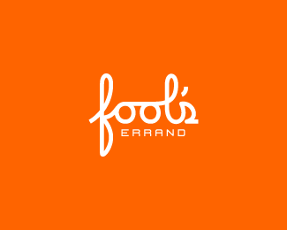
This is a logo I made a long time ago. Someone jacked my old account on here, so I had to delete it. So, here it is again.
As seen on:
Fool's Errand
Status:
Student work
Viewed:
15086
Tags:
pin
•
shoe
•
bowling
Share:


Lets Discuss
Greg Idea?
Reply%5E yes!
ReplyThat was me.
ReplySorry to hear about your account :/ Nice work.
ReplySorry, I meant a !great idea!
ReplySorry, I meant a !great idea! :)
ReplyVery clever
ReplyFaved again, big idea.
ReplyToo bad, I remember this had a tons of floats, still great work, mate.
ReplyYea great work! Looking forward to more!
ReplyNo idea. Could have forgotten to sign out at school maybe.
ReplyVery clever , i was thinking the shoe should be the harder one to spot and the pin to be easy ? what do you think , did you try that?
ReplyFaved, totally brilliant! Well done!
Replynice job!
ReplyI swear I had already floated this. Error corrected.
ReplyClever !
ReplyI love the simple brilliance to it
ReplyClever! Very nice mate.
ReplyThis one goes straight to my favs...great work!
ReplyI had a super extendo aaaaaa-HA! moment with this one. At first, all I saw was the shoe. And then I stared at it for a few seconds trying to make the connection. I kept going, %22Ok, I see the shoe, but how is it a BOWLING shoe?%22 And then, as if a hand popped out of my monitor and slapped me upside my thick skull, it hit me. So simple, yet so utterly brilliant. I love this long time.
Replygood job !
ReplyThis is great!!
Replysimple but simply huge! Hope it sees the light of day :-)
Replyreally great idea - simple but very strong. Congratulations!
Replywatch this .... http://brandstack.com/logo-design/details/35553 .... are you this guy?
Reply%5E Wow, practically that guy's whole portfolio at that link is ripped off work!
Replyseriously would like to know why people think this is okay.
Replywww's dark side ...
ReplyThanks for the heads up David and other Logoponders... this user has been removed from Brandstack. Thanks!
ReplyVery nice clean and simple. Good work.
Replysimplicity works well. always!*definitely faved :)
Replyyou negative space genius you!
ReplyVery inteligent!
Replyfantastic idea!
ReplyPlease login/signup to make a comment, registration is easy