KINGSBURY
by alterego • Uploaded: Feb. 14 '11 - Gallerized: Feb. '11

Float
(Floaters:
72 )
Description:
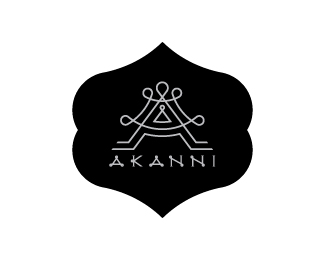
( Upscale nightclub in Chicago )
KB monogram . It could be considered as just 'K' also. Here you can see a unique 'K' shape and in the negative space of the k you can see a B as well. Finally an interesting part of the logos is: The 'K' shape is created with a unique crown shape!! can you see it? :) Look at the wings of the K. There you can see a 90 degree rotated crown!
Status:
Unused proposal
Viewed:
18016
Share:


Lets Discuss
Slick and classy buddy!
ReplyClassy indeed!
Replybut lose that bg :D
ReplyThanks guys. I really appreciate your words :)
Replyno need f th description :)
ReplyThanks Stelian... you were right :)
Replynice authentic!
Replydiggin this
Replygreat work!:)
ReplyThanks guys ...Much appreciate your comments :)
ReplyGreat work, Shylesh!
ReplyNice mark %3B)*
ReplyLove the arrow going left :) Great mark Shylesh... not so shy.
ReplyNice one Shylesh!
Replythanks fellas :) thanks for good words ...
Replysweet mark, type is interesting, customized?
Replyyep man but not much .. i haven't got enough time for it...in fact about 3hrs :)
ReplyNice, shylesh!
ReplyI bet that this is next gallery spot :)**Great work.
ReplyVery stylish. Great one!
ReplyThanks friends...**@pjmaster**haha I hope so buddy but sometimes hopes are just hopes only :)
Replyclassy!*but I think G and S need to be refined
Replyvery good work! classy indeed.
Reply%5E I agree with Christopher, G and S seems odd compared to the rest, though the mark is sending classy vibes.
ReplyLove the font too!!
ReplyThanks for the feedback guys . I hope now the G and S become perfect. What you think mates ?
Replyy is the S going form san serif to serif?
ReplyK-B - shock amazing king)
Replygood work!
ReplyIt's like my idea with H and B monogram. But in other hand it looks great!
ReplyHelp me draw the logotype plz!
ReplyThis is great man! Mark is strong and unique!
ReplyAmazing work mate.
ReplyVery stylish !
Reply@action**http://gadgetophilia.com/wp-content/uploads/2009/04/baby-crying.jpg**:)
Replyalterego, I don't have nothing against you buddy.*Just saying that after you made this logo you have already seen my version of H and B monogram and I think this logo idea isn't very unique like serhos think :)**Peace %5C/
ReplyGreat mark!:)
ReplyLike it alot!
ReplyPlease login/signup to make a comment, registration is easy