Magic Identity
by felro • Uploaded: Jan. 16 '10 - Gallerized: Jun. '10

Float
(Floaters:
77 )
Description:
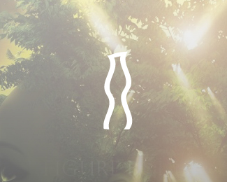
I have re-branded from "felro" to "Magic Identity". I'm still felro though, it is my nickname of course.
Magic Identity:
The word Magic represents the various interesting (yet sometimes weird) thoughts in my head and my thought process which helps me obtain a desired result in anything I do (mostly designing, since that's what we're talking about here). The word "Identity" represents one of my services as a designer, it includes branding which is the identity for a company. This icon represents a male (me) holding up his tool or his weapon of choice (This is my version of the Magic Wand tool). The meaning behind this icon is seeking knowledge through enlightenment. The wands light guides me straight along the treacherous path when seeking the road of knowledge (knowledge in all aspects of life and things. It is the factor that helps me obtain an answer to a problem). I am a fond believer that the road to knowledge is straight and true, one errs and errs and errs again...but less, and less, and less. The Magic Wand is the enlightenment I need to obtain knowledge, which is the real tool to obtaining a desired conclusion.
Status:
Client work
Viewed:
18589
Share:


Lets Discuss
Very nice Felipe. I see a rocket in the negative space between his legs for some reason too, sure it was nintentional.
Replyunintentional*
ReplyYea that was unintentional, thanks commenting Joe!
Replyi love it! great idea felro, awesome silhouette
Replygreat logo! have you considered turning the torch handle into a narrow triangle (with the point down) so that the geometry of it would be more coherent with the pointy arm? i think it would the perfect that way. nice one %3D)
ReplyThanks Sean and ideoma. I really appreciate the comments and floats guys. I'm extremely happy with the way this one came out. It is very solid and it represents me very well as a growing artist. I feel and see my style of design slowly but surely changing.**Yeah, the torch handle was a narrow triangle when I started designing it. I felt it complimented the male in the icon, but I also felt that it took a lot away from the original shape of the Magic Wand tool. Even though this is my magic wand that I'm holding, the wand should still have its original handle shape, it is the light that shines differently because of the person who's holding it. Thanks again for the comments guys!
Replyi luv the design along with the concept and the thought u put into it
ReplyThanks man that means a great deal to me.
ReplyYo Felro, my man, just to show you, I did a simplified version of this concept a month ago, so take a looksy http://logopond.com/gallery/detail/87044
ReplyWhat's up Alen. Yes, I see the similarity that there is a figure with his arm raised with an object in his hand. I've never seen that logo of yours bro, I've must have missed it, it's not my style to imitate or copy, so I apologize for that if you feel like it's too close to yours. I do feel I put a lot of time, energy, and great thought into Magic Identity and my initial thought is to not change it. However, if you feel that it's unjust, then I'll change it up bud. It says on the description that it's a work in progress, have you finished the final?
ReplyAll good bro, just wanted to show you, those 2 can stand together and mine is still wip (it'll be for an online design blog)...
ReplyAlright bro, sweet. Keep me updated on that logo bro.
ReplyDealiyo Felipe!
Replylooks nice.
ReplyThanks KGB :)
ReplySmashing.
ReplyVery happy to have read your comments guys. I'll definitely look into your pointers. Shadow and %22by Felipe Rojas%22 will definitely be gone when I include it on the website I'm working on. Something just told me I needed to leave it up there for now. Thanks again gentlemen!**-felro
ReplyCool.
ReplyThanks buddy %3D)
Replydig the high waters the most :)
Reply%5EHa! Yes, love the floods!
Replythat's weird, it's my favorite part too, hahah
Replyahahha funny stuff :), great new logo man!!
ReplyThanks a bunch man %3D)
ReplyAbsolutely gorgeous. Perfect example of simplification. Good stuff man - the only thing that bugs me is the left shoe. Its got more of an artsy feel. Not sure if that was intended.
ReplyAwesome mark! :)
ReplyAppreciate it fellas, thank you
ReplyThanks for the floats
Replythis is great!
ReplyThanks Gary
Replylove your story behind the concept! All the best luck with your new identity mate! the mark looks phenomenal!
Replywow this is really nice.
ReplyAppreciate it fellas! :?)
ReplyAlways liked this one Felro. Good touch.
ReplyThanks buddy :?)
ReplyAlways dug this guy :)
Replylove your explanation for your brand. well done.
ReplyThank you both. Yeah lumo I put a lot of thought into this one, and I'm still very happy with the way I executed.
ReplyI love it. I could do without the gray %22streaks%22 coming from the wand, but it's not a deal-breaker.
ReplyThanks man, it's fine though.
ReplyHi, a nice mark. Yesterday i saw a rip-off at hatchwise. *http://www.hatchwise.com/entry/L2338-20100611080630.jpg
Replythe webster, Agree with you here. There is really no comparison to the quality shown here.**And, yet these places seem to be doing ok. no?
ReplyThanks for the link Webster. It's happened to me before and to several designers here at the pond. The only thing I could really do I feel is make a hatch wise account and put the guy on blast for giggles...
Reply*its
Replyi just wanted to say how stunning this logo is, as is the rest of your work, mis respetos.
Replygracias por tu palabras amigo
ReplyShoelace is a nice touch :)
ReplyThanks a lot guys
Replycongrats for gallery spot.. nice..
ReplyWhat are you wearing!? :-p**Really like it. Very strong, positive and uplifting identity.
ReplyThanks a bunch guys, means a lot.
Replynice one:)
ReplyThanks bud :?)
Replygreat style.
ReplyGreat idea, perfect logo. I too see a rocket. :)
ReplyaDSASDAD
ReplyThanks gentlemen aoww
ReplyLoved it!
ReplyNice! Well done.
Replyin my opinion , i think if you redesign it with Magic Wand only , that will be more better
Replynahh
Replywhich font??
Replynew
Replyit would suit me%3B)
Replyhahah
ReplyPlease login/signup to make a comment, registration is easy