Description:
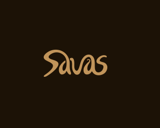
wip. another version of logo for candy, chocolade manufacturer. need your thoughts.. thanks. custom type. chosen by client:)
Status:
Client work
Viewed:
13666
Share:

Lets Discuss
I like it %3D%5D
Replythanks Filipe:)
ReplyYour work is inspiring.
Replygreat work on this one, mate:p
ReplyThis is great! I like the color too*Well done!!
Replyrealy apriciated:)
ReplyWorks for me!
Replylike,like,like!*Wonderful work,David %3B)
Reply%5E agree with Alen re. the small twirl in the second 'a'. Other than that, great job! : )
Replygood work
Replythanks all. think this swirl adds feel of some kind of caramele, or chocolate
Replyneblogas, skanus :) tas swirlsas abejoniu kelia. sveikinu patekus i pirmo puslapio showcase :)
Replyaciu :)
ReplyCongrats Deividas
Replyexcellent typography :)
ReplyLOVE IT
ReplyLoving this, beautiful typography!
Replyvery nice on c8
ReplyCongrats on your gallery spots Deividas! Well deserved :)
ReplyYeah nice triple banger! This logo is gorgeous, the flow is beautiful and it all fits so nicely together. Well done
ReplyNice custom type work, Deividas! I'm not bothered at all by that little swirl in the second A. I definitely get that it represents chocolate being poured.
Reply%5E%5Ecorrection... Quad feature
ReplyFantastic Four %3B-)
Reply%5E So where's Jessica? Congrats Deividas.
Replythanks guys, it made my day:)
ReplyOchen' vkusno!*Vot tebe horoshee radio v podarok - http://www.sky.fm/play/tophits
ReplyNice.... they should put this as a font type in word :)
ReplyCongrats on the gallery spot, Deividas!
ReplyHehe, the name makes me think of Savas Pascalidis :)) Nice flow on the design! Congrats for the well deserved gallery spots! :D
Replysweet type here.
Replylovein it.
ReplyCool flow. Like :)
ReplyVery Well!
ReplyPlease login/signup to make a comment, registration is easy