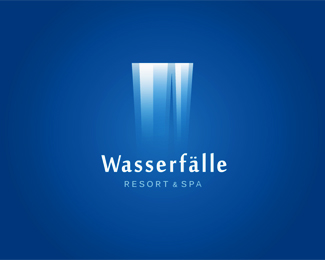
Description:
German Logo concept for a Resort & Spa. The waterfall is an abstract 'W'
Status:
Work in progress Viewed:
16952
Tags:
hotel
•
spa
•
resort
•
waterfall Share:
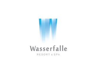
I have to agree with Glen and Alex. I definitely preferred the last version. It had a certain simple elegance to it that was lost when these other elements were added.
K, well I switched it back to the original. I do admit, I love the crisp look of this design much more. I added the effects to the alternates to give it a bit more dynamics, but I agree that there\'s much more drama in this version.
Hanuman, Alex, Siah, Thanks guys. Yes, I have to thank Colin for the push to remove those lines! I don\'t know why I was so attached to them in the first place :P


Lets Discuss
quite nice. the script is a tad playful for my liking but that mark is a beauty.
ReplyThanks for the feedback Glen! Yeah, I\'m still working on the type, I want a relaxing effect... Thanks for the float Kristen :)
Replyyou really captured the \'relaxing effect\' mentioned
ReplyThanks Raja, it means a lot! Thanks for the floats all! :)
Replybrilliant.
ReplyHmmm...I liked it much better a couple of iterations ago with the wider falls and none of the little sparkles. Lost it\'s elegance for me.
ReplyI agree with Glen. Too much going on now and lost it\'s uniqueness of the previous version trough those \"random\" little sparks IMHO.
ReplyI have to agree with Glen and Alex. I definitely preferred the last version. It had a certain simple elegance to it that was lost when these other elements were added.
ReplyThese are great critiques you guys. and thanks to all the floats everyone! Thanks David for the spot as well, much appreciated :)
ReplyK, well I switched it back to the original. I do admit, I love the crisp look of this design much more. I added the effects to the alternates to give it a bit more dynamics, but I agree that there\'s much more drama in this version.
Replylooks better like this. i would also consider removing the horizontal lines above and below \'resort & spa\'. i don\'t think they are necessary.
Replysooo nice
ReplyVery nicely done, love the effect.
ReplyLove this. Only thing I\'d tweak: the text. The type for \"wasserfalle\" just doesn\'t do it for me. Rest of the type is nice, though. Lovely mark.
ReplyColin, Olivier, Sean, JF, thank you for the compliments and feedback! Wow, and thanks to all the support everyone! It means a lot, thank you :)
ReplyLove the logogram...:)
ReplyLooks great this way! Was a good call to remove the strokes between the typography.
ReplyGreat concept and execution!
ReplyHanuman, Alex, Siah, Thanks guys. Yes, I have to thank Colin for the push to remove those lines! I don\'t know why I was so attached to them in the first place :P
ReplyLove those colors.
Replyexcellent! what\'s font is it?
ReplyPretty brilliant!
Replythis is love
ReplySorry for the delayed response, but that you kindly everyone!
ReplyPlease login/signup to make a comment, registration is easy