
Description:
.
As seen on:
CLEBERFARIA.COM
Status:
Just for fun
Viewed:
31023
Share:




Lets Discuss
Thats cleber!
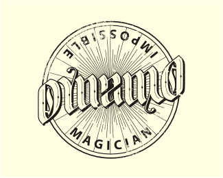
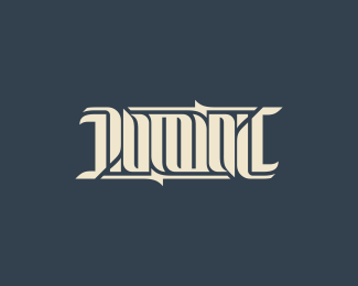
ReplyI'd like to see the square/lock body rounded off at the corners by a teensy bit. Also, I'd move the square/lock body a little to the right, by a pixel, just enough to help the viewer see the far corner of the lock better. Overall, fantastic execution.
ReplyThanks Nicholas!
ReplyHi JF, I heeded their suggestions. I think it got better. Thanks.
ReplyHi JF, I heeded yours suggestions. I think it got better. Thanks.*%22google.translate%22 %3B)
ReplyVery smart, mate.
ReplyThanks milou!
ReplyShrewd!
ReplyGreat Concept
ReplyChris and Carlos, thank you very much%3B I'm very glad you like it.
ReplyGreat!:)
ReplyThanks Ru.
Replyso simple and so well done. very nice.
ReplyCould be better executed, but can't complain. Wish I thought of that.
ReplyConcordo com o Mike, Cleber. Acredito que voc%EA poderia melhorar um pouco a execu%E7%E3o. Entretando %E9 um conceito muito bom, cara. Queria ter tido essa ideia! Parab%E9ns, amigo! :D
ReplySmart idea, nice job.
ReplyMore brilliant simplicity
ReplyThanks Colin.
ReplyThanks Mike. I'm very glad to have my first logo in the gallery.
ReplyValeu Breno. Admiro muito seu trabalho e sua opini%E3o vale muito pra mim. Obrigado cara.
ReplyThanks Raoul. %3B)
ReplyMatt, thank you very much. I'm glad you like it.
Replyvery cleber!
ReplyThanks Raja :) I love your edge logo.
ReplyYes, very clever, love this!
ReplyThanks Sean, I love your works.
ReplyGrats on gallery. Smart and simple!
ReplyThanks Jovan. I'm very glad it is on gallery.
ReplyVery clever. I like how simple yet effective it is.
ReplyJustin, thank you very much!
Replyhttp://logopond.com/gallery/detail/40490
ReplyHi Ru, whenever I have an idea, I research before to see if it is original. It's a surprise for me to see this logo with the same concept. I swear I did not know about this.
ReplyIt's ok, man. Neither do I.
ReplyVery cool.
ReplyThanks Kin.
ReplyCool!!!!
Replyclever!:)
ReplyThanks Larisa.
ReplyThanks Deividas. I love your Diana Frank logo.
ReplyVery very very nice. Great job, very good
ReplyObrigado Moises, seu Piano Rio %E9 fant%E1stico.
ReplyThanks Romanovich.
Replyclever - really clever this little piece of art !!!! love it !
Replyvery nice, Keep it simple stupid :)
ReplyBernd and Aron, thank you very much!!
ReplyThanks Marcin.
Replygreat!
Replyvery clever.*
ReplyNazer and Brayo, thanks!
ReplyVery smart.
ReplyThanks Antonio.
Replylove the %22AHAA!%22 moment. The viewer is part of the mark. Very clever.
Replythanks andrewrose. %3B)
Replyawesome concept!
ReplyThanks Luca.
ReplyCongrats on this one, mate!
ReplyThak you very much, Zsolt.
Replygenial!
ReplyThanks Vicente.
Replycool
ReplyFloated!!
ReplyThanks Petro and Rudy. %3B)
ReplyGreat idea. Simplicity is the key!
ReplyCool concept:)
ReplyThanks Dan and Ivaylo.
ReplyThis should be in any logo design antology book!
Replyclever
ReplyClver
ReplyPlease login/signup to make a comment, registration is easy