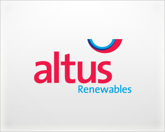
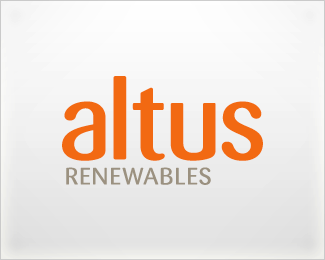
Altus Renewables
by c4creative • Uploaded: Jul. 07 '08 - Gallerized: Jul. '08

Float
(Floaters:
19 )
Description:
Concept 4: A transformation of the A & R into a shape with directional movement to represent continuous forward thinking.
Status:
Unused proposal
Viewed:
7515
Share:
Lets Discuss
Mark seems large in relation to text, but nice none the less.
ReplyDitto above. Love the mark but layout is all over. Mark is big. Renewables is small. Great monogram though.
ReplyThanks guys! This concept didn't make it to the client, so it wasn't refined too much. The client wanted to focus more on the word Altus rather than renewables, hence the scaling. Thanks for the feedback.
ReplyNice job but the mark looks like an R, can't see the A in it. Also agree with above.
ReplyTry using both hands Mr. Maybe then you could find your A.
ReplyI read Raltus when i see it
Replynice mark mate!
ReplyThis is very nice. Perhaps consider a lock up with the mark above the type left aligned? That might remedy the 'RALTUS' issue.
ReplyThanks for the comments guys :)
Replygreat mark... Id look to recycle that in another project if that was possible.
ReplyPlease login/signup to make a comment, registration is easy