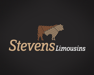
Stevens Limousins
by c4creative • Uploaded: May. 07 '08 - Gallerized: May. '08

Float
(Floaters:
18 )
Description:
A concept for a breeder of prized Limousin cattle. The pattern within the bull is representative of the way the show cattle are groomed/brushed. Open for comments - logo 4 of 4.
Status:
Nothing set
Viewed:
7517
Share:

Lets Discuss
This is my favorite of the 4. It flows well, the dropshadow on the type is subtle, and nicely done. I love the idea of the pattern being reflective of how the cattle are groomed, and I also like the capital 'S' at the beginning and end of Stevens. Red and the soft goldish brown works as well. Stands out. Checkin out your other logos now. :)
ReplyGorgeous! This one is definitely the winner for me too.
Replylovely colours and mark. Like the label. Would be perfectly produced in metallic-plate (3D)! nice work also with the pattern in the bull.
ReplyThanks guys! I really like this one also. It has greater warmth than the others. Thanks again for the nice comments.
ReplyNice stuff mate. This is my fave of the bunch and the pattern in the image is killer.
ReplyThanks Croops! Yeah, this my fave too. Although the client has come back and wants the logo to be blue and silver. Typical.
Replylooks nice.. thought though at first glance it would be something to do with meat.. has that look about it.. %26 the way the animals been carved up!
ReplyThe enclosure kind of bugs me, but overall, this is very nicely done. Love the pattern on the bull.
ReplyMy fave from the group as well, love that grooming!
Replyvery nice
ReplyThanks guys!**@nido - Good point! I do see where your coming from there. Never thought of it that way.**I have an updated version, just waiting to be approved, will post once this is done. Thanks again.
Replyat first glance it actually made me think of a tomato sauce (ketchup) label. **Some irony there I realise %3B)
ReplyI think it is too much like a label as well. Take away the shield style background and the accents to either stide of Limousines in my opinion to get away from the packaging look.
ReplyWhen I designed this logo. Research was undertaken into current logos for the cattle %26 dairy industries and I found that the majority were purely typographic logo and actually all very similar in layout. I wanted to create a unique logo for my client and I felt creating an enclosure was the solution. Overall I feel this logo meets the clients needs, a consideration was that this logo was going to be displayed on the throw overs on the cattle to keep them clean while they are not showing, which this logo would look great and definitely stand out. I do agree that the colour red gives the logo a packaging feel, but I don't think that's a bad thing - the final colour of the logo is actually blue. I will upload when I get a few minutes.**Thanks for the discussions.
ReplyThe final logo is actually in my showcase.
ReplyBlue would definitely stand out better against the limousins. Do they raise red or black?
ReplyYeah, blue does make the limousins stand out more, but I still think the red creates more warmth. They raise predominantly red limousins.
ReplyPlease login/signup to make a comment, registration is easy