Blue Mountain Electric
by brandclay • Uploaded: May. 11 '10 - Gallerized: May. '10

Float
(Floaters:
117 )
Description:
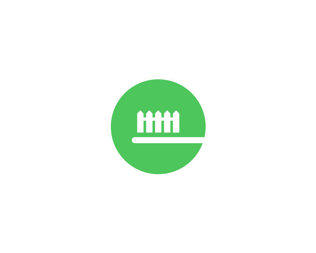
Logo Design done for Blue Mountain Electric.
As seen on:
Brandclay
Status:
Client work
Viewed:
27,335
Share:


Lets Discuss
the type is a bit bold imo, but other than that, cool
Reply@misternoname - if I had it my way, it would jave been different
ReplyThis is very nice looking Sean, type fits well too IMO. Sweeeet!
ReplyI like that idea.
ReplyI'd be pretty damn happy if I'd come up with that icon design. Brilliantly simple. Good work!
Replyit came out pretty fuzzy...*
ReplyVery cool Sean!
ReplyWell done Sean, feels like it's a clean energy company.
Replythanks guys, appreciate the comments, haven't posted too much lately.**lots more to come %3B)
Replygreat concept and execution, Sean. really like the icon.
Replyniiiiiiiice!
Replysimple %26 nice
Replylovely!
Replyvery clever, very nice.
Replylove the mark Sean!
Replysimple and nice.
ReplyMt fantastic!
ReplyNice one Sean.
ReplySimple, iconic, memorable, timeless...and all those other logo cliches. Nice work, bud.
Replydefinitely usable! great job!
Replyvery cool, Sean!
Replyamazing job mate
ReplyGreat one, Sean!
ReplyBrilliant solution. Great work.
ReplyI'm waiting for more bud! Good one.
ReplyMark is great. Gotham is one of my favourite fonts it always look nice in allcaps.
Replyhey guys, thank you - really appreciate all the comments! more to come soon!
ReplyI like it a lot, it's not extremly creative nor have special flow. But I find it really good for an electric company, and I also like the execution.
ReplyLooking good, Sean, nice and simple :)
ReplyIt is victory!)
ReplyLove it! It's a big winner !!!
ReplyGreat job!
Reply:)
Replygreat mark!
Replynice
ReplyWhat a magnificent concept (Y)
ReplyPlus certainly, but in this job is something pushing away
Replythanks everyone, really appreciate your comments
Replyreally nice concept here - for my eye I'd like the cut angle of the mountains to match eachother (on the right) but that's just me.
Reply%5E %5E Holy cow, that's a great eye you've got there. Never would have noticed it.
Reply@logopunk - not sure i follow? let me know, thanks!
ReplyLove it!
Reply@anthony, yah I think you're right.
ReplyVery nice concept.
Replyreally smart. but, looks unfinished. because of that too bold font and%3B not really balanced kerning between the sign and the name%3B and, AnthonyLane said something for mountain angels. also,maybe, it would be better to reverse those sign colors: blue mountain (for consistency to the name) and white for skies.
Replyone great logo
ReplyPetar K, I agree very much about the color of the mountains, they ought to be blue rather than white. I also think that the symbol could stand to be closer to the name. Or perhaps tighten the leading in the company title. Regardless, this is one of the sweetest real world designs I've seen here.
ReplySweet logo!
ReplyNice mark Sean. Agree about font but there is no other way when its what they want :). Good work!
ReplyFew logos are as impressive as this. Its simplicity and clarity allow it to be immediately comprehended and retained. So few achieve that and therefore fall short. As impressive as most other logos I've seen on here are in their own right, none come close to Blue Mountain Electric.
ReplyDiggin this!
Replysimple and perfect. kick ass!
ReplyPlease login/signup to make a comment, registration is easy